VE-ERP
BACKGROUND
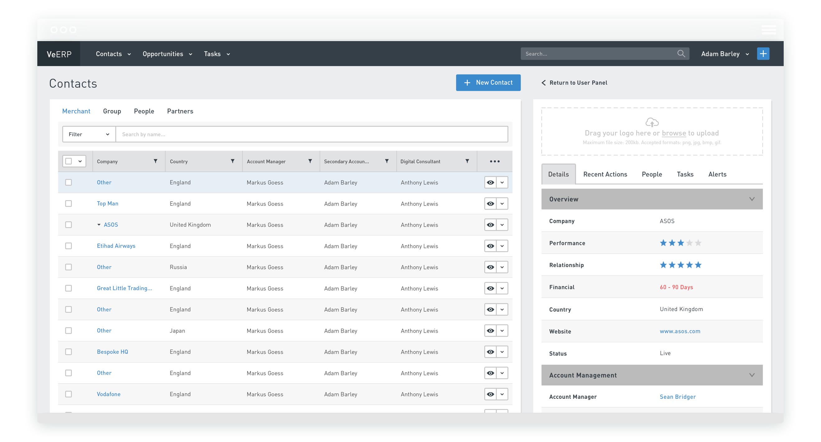
At the time the UK’s fastest growing technology (Times Tech Track 100 - 2015), Ve Interactive grew a phenomenal amount during my time there. One of the challenges this created was managing not only a growing volume of staff and customers but also the relationships between them. A custom built software eco-system of multiple areas that contained Customer Relationship Management, Enterprise Resource Management and even Finance, Ve-ERP was built to tackle this. However, it had a poor internal reputation and had become bloated as the needs of it’s users - Ve’s staff and primarily those who are customer facing - were ignored.
ROLE
Given design leadership of Ve-ERP, I was tasked with working alongside it’s product manager and the company’s head of product in order to improve how well the product was serving it’s users. To do this, I led user research in order to better understand our users needs, attitudes and goals before later taking sole charge of both UX and UI.
UNDERSTANDING USERS
A product that primarily served the company’s sales and account management departments, who were spread across 18 countries, it quickly became clear that Ve-ERP had lost sight of it’s users. A top down approach to features had been taken and many of it’s sections were going un-used while the most useful information and actions became hidden in more and more clutter. With a lack of uptake becoming a problem, it was essential to create a tool users felt was working for them, rather than creating unnecessary admin.
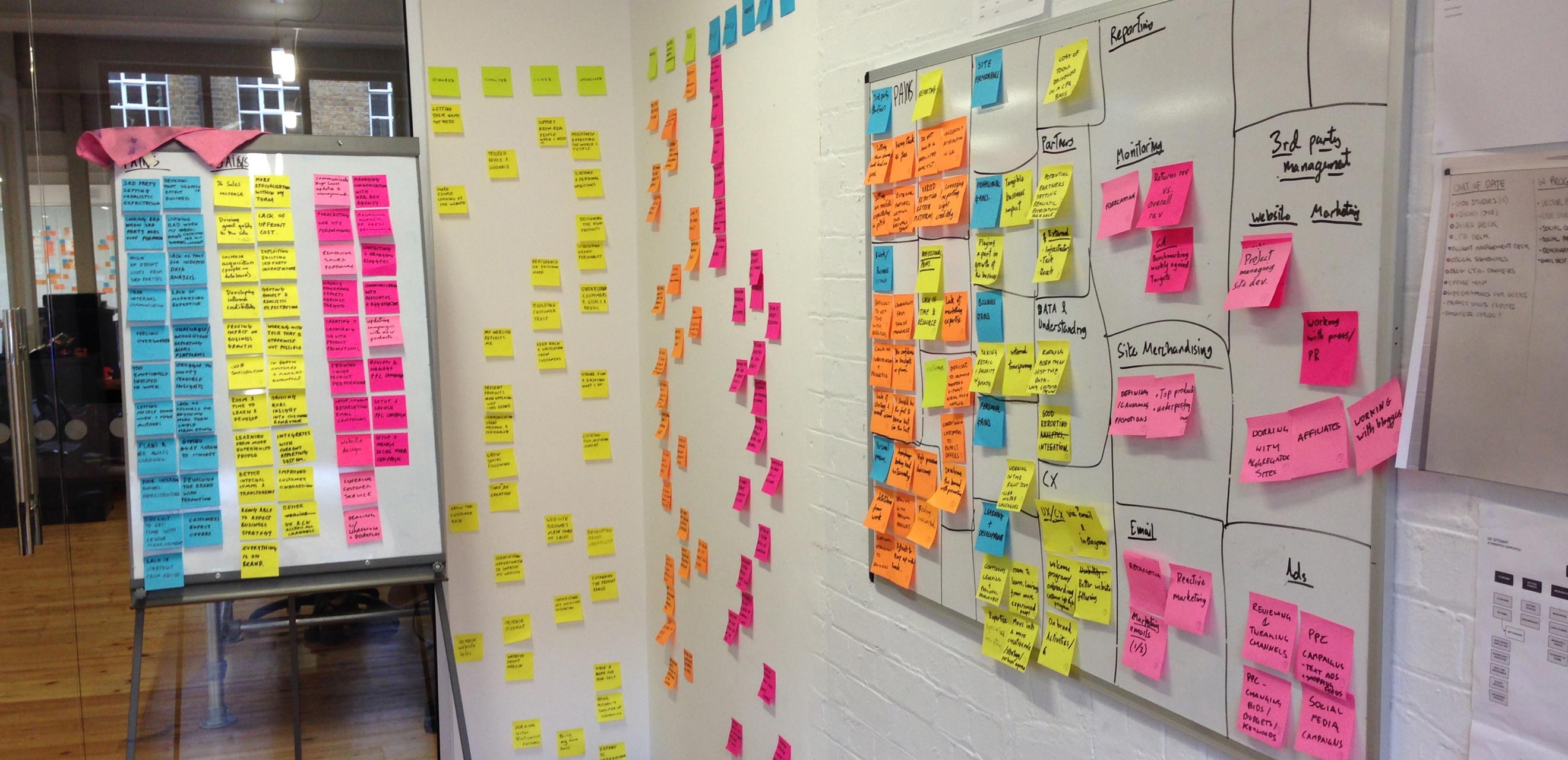
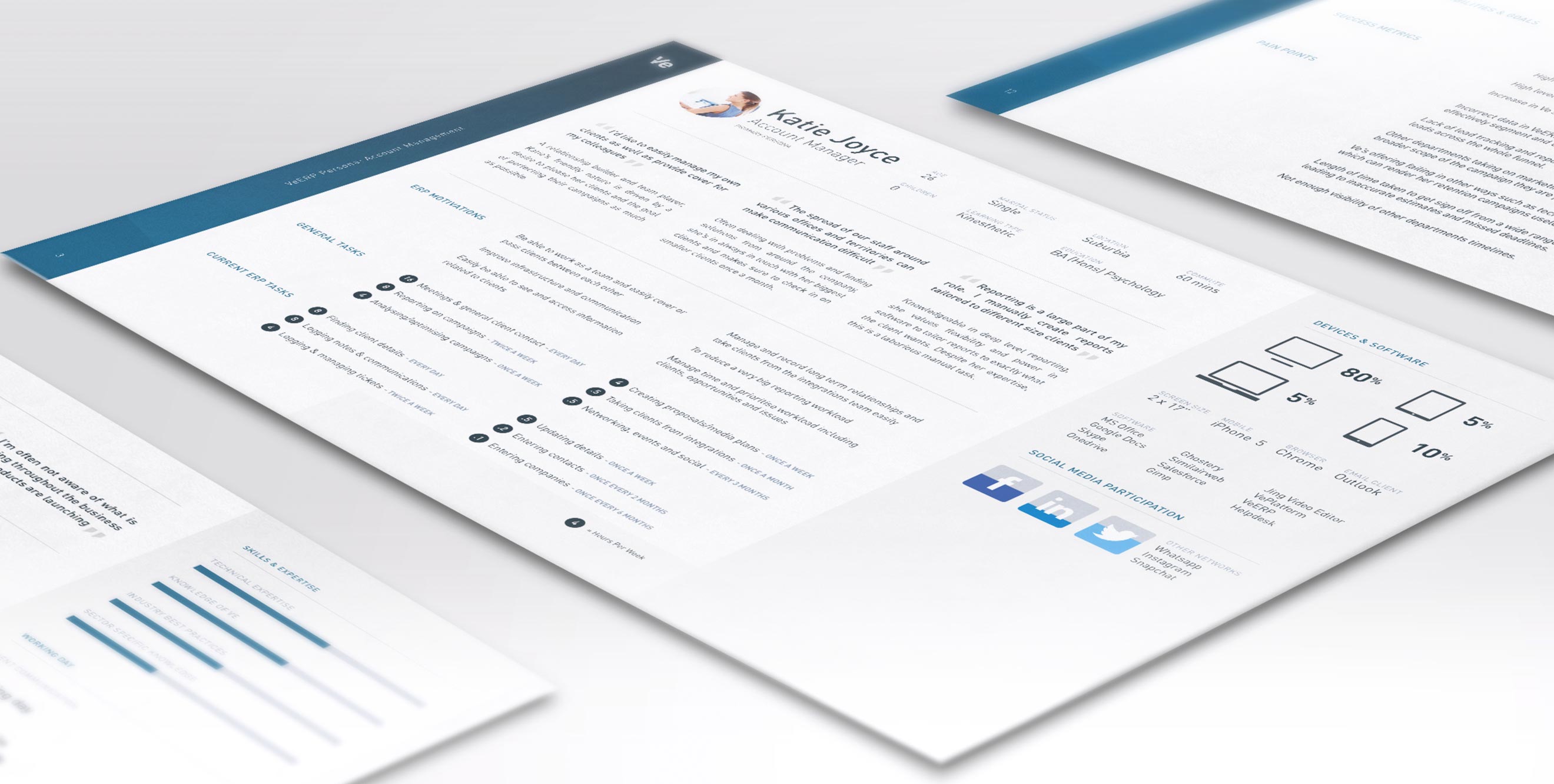
In order to lay the groundwork for a more user centric approach, I decided to run a research project in order to generate personas that would help us to truly understand the users. Conducting 32 interviews as well as asking users to carry out other tasks such as diaries and card sorting, I created five personas. Initially focusing on company roles who had the biggest reliance on Ve-ERP, I used a Jobs to Be Done approach in order to understand not only their day to day work but also their goals, pains, values and success metrics.
FOCUSING ON COMMON ACTIONS
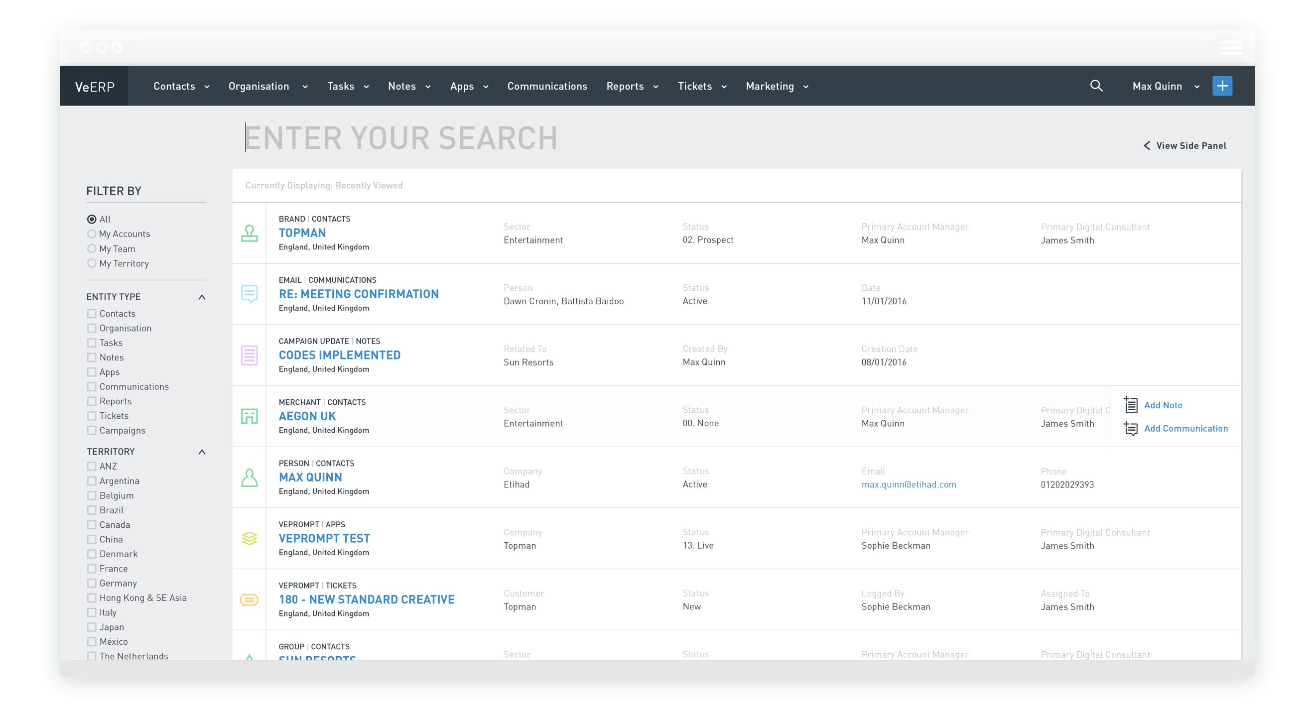
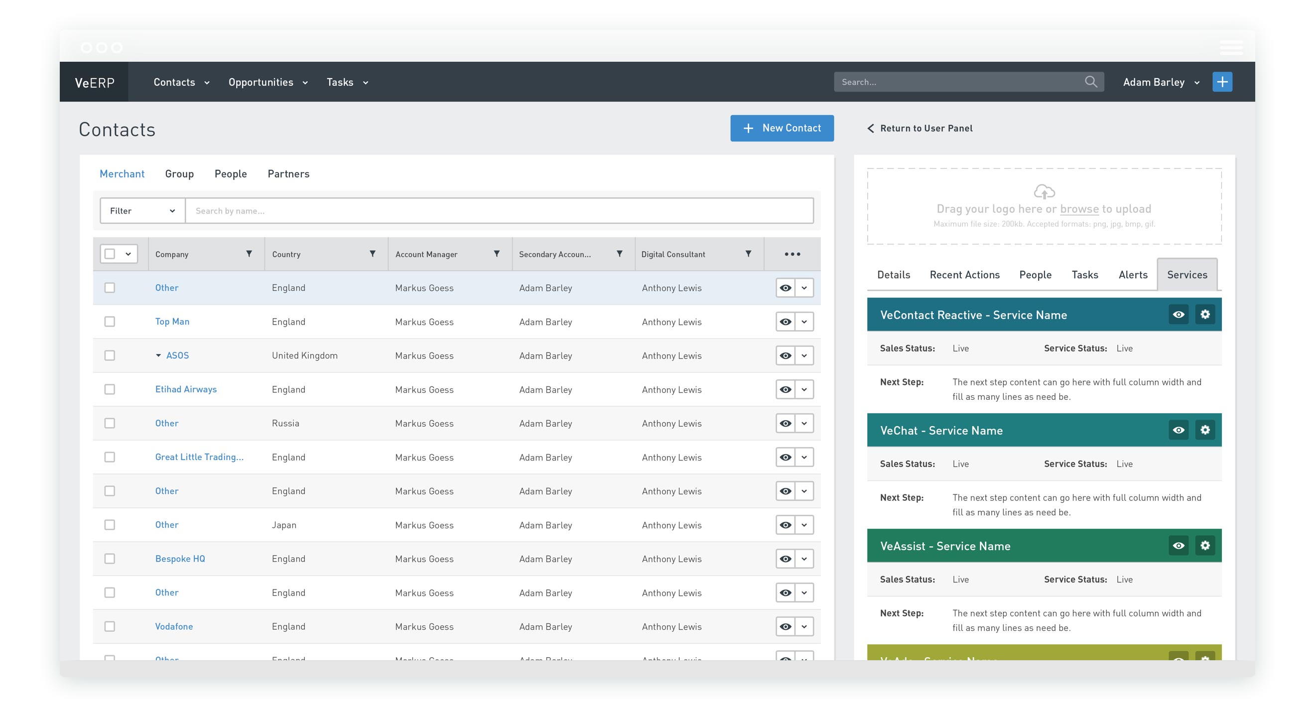
It became clear during research that there was one that took up the majority of all user’s time on the platform - finding clients and information about them. As most staff members deal with a relatively small number of clients, this tended to be information they had looked at recently but rather than being immediately accessible it was hidden among reams of information about everything in the company.
My initial reaction to this was to create personalised dashboards that would show the most relevant information to each user, but due to time constraints and how pressure the issue was we would have to find smaller ways to move towards this. Instead, I focused the initial screen around a search system, instantly giving users a cursor to quickly search and see real time results. It would also by default display their most recently viewed items to provide some personalisation and save a lot of time and effort in the vast majority of cases.
CUSTOMISATION
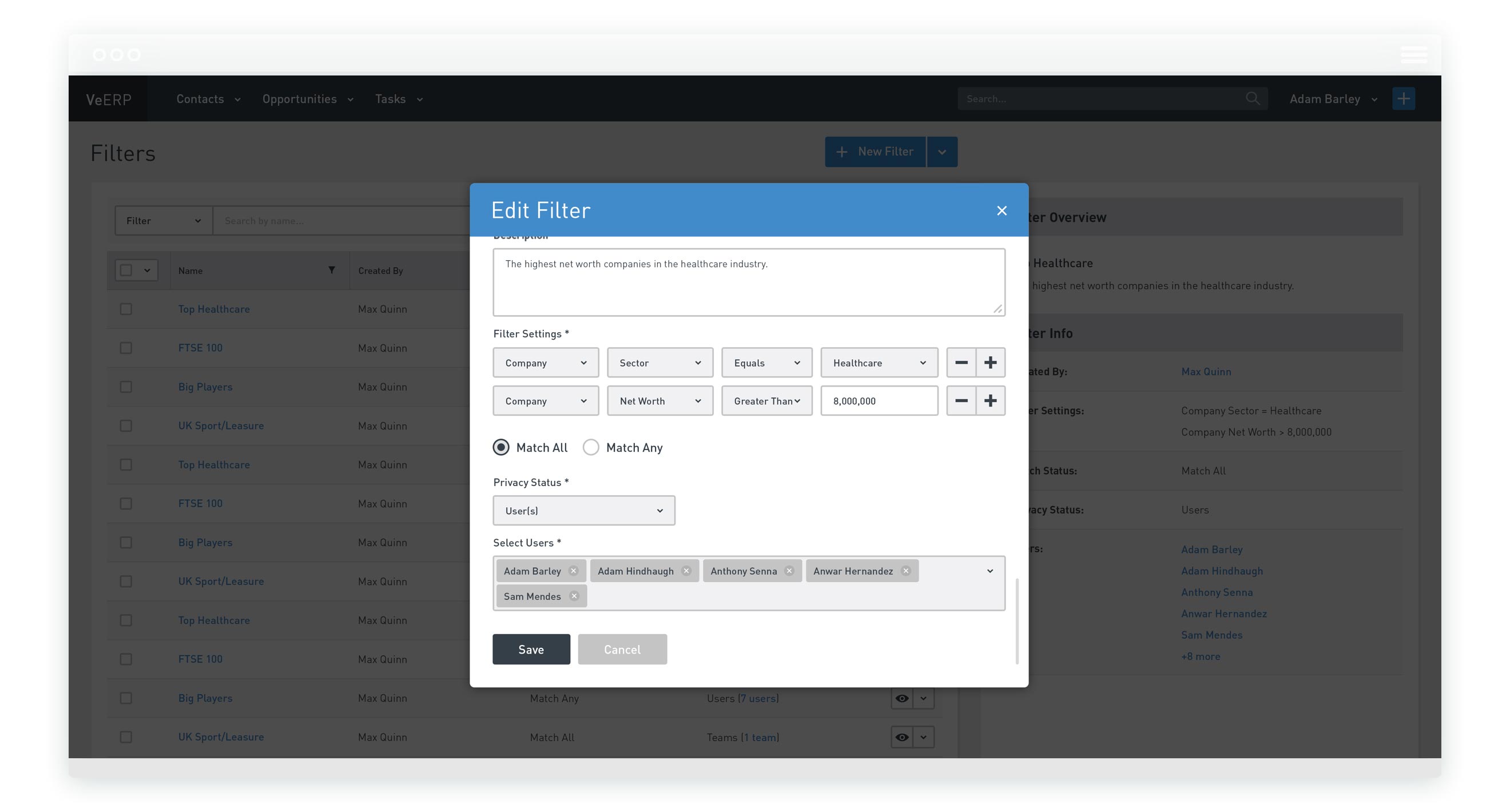
By nature of serving so many different people, Ve-ERP was a product that contained a lot of information useless to the majority. This couldn’t be removed due to it’s niche but essential uses to smaller groups. A quick solution was to utilising the existing infrastructure that contained a comprehensive array of tags and information to create saveable filtration which could, by choice, allow power users to change their default views. Allowing managers to set initial views for their departments or individual roles, this feature also took us further towards a personalised product, increasing efficiency while reducing training time and information overload on new staff.
QUICK ACCESS
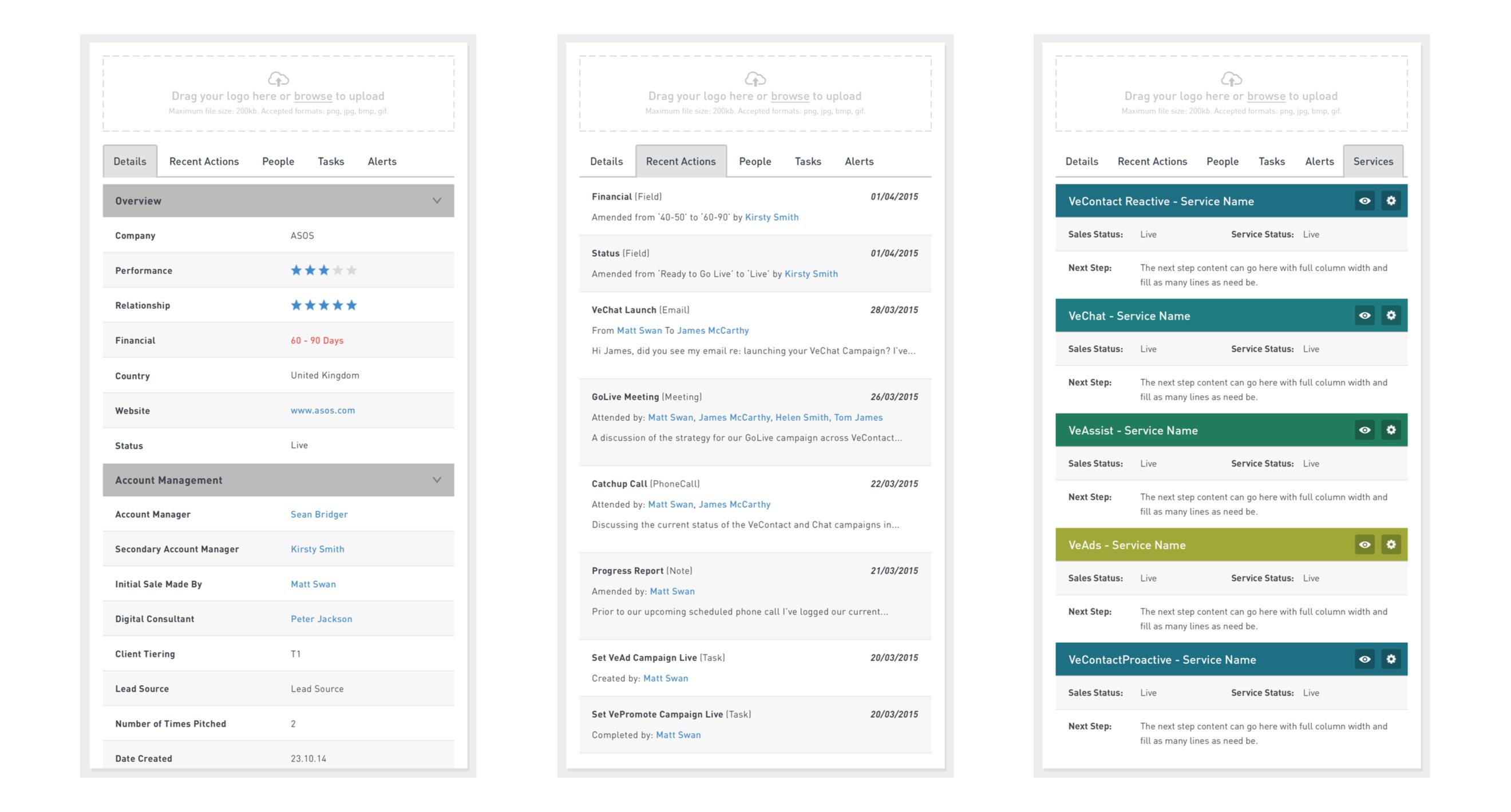
Another key output from research was insight into what information was most essential different members of staff. While a great deal of information needed to be stored within each entry, allowing quick views to show the most often viewed information posed the opportunity to greatly improve efficiency in the product. We implemented a side bar with various tabs to quickly display and categorize this information. Toggled to show or hide, it allowed users to reduce clutter when need be and the side bar pattern meant that it could be used to compare entities - something research showed that users were doing themselves using a fiddle system of multiple browser windows.
CLEAR HISTORY
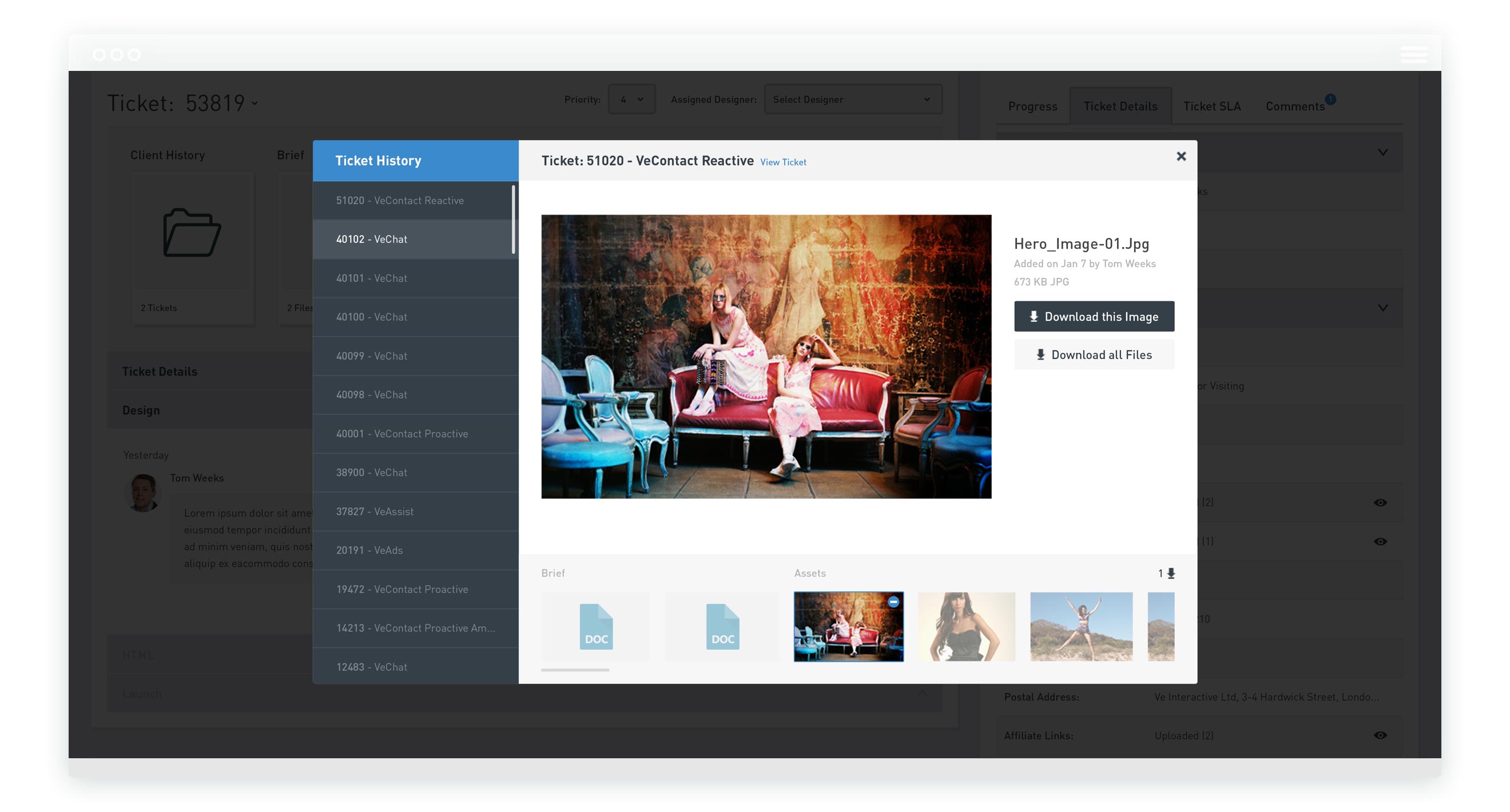
Particularly for account managers and designers, using the system in collaboration to create email and web marketing designs for their clients, it was very difficult to see what had been previously created or discussed for a particular client. This was essential not only to facilitate communication but to make use of older assets and work on top of existing design files.
We implemented history views throughout the product in order to quickly and clearly provide access to this information.
CONSOLIDATED CONVERSATION
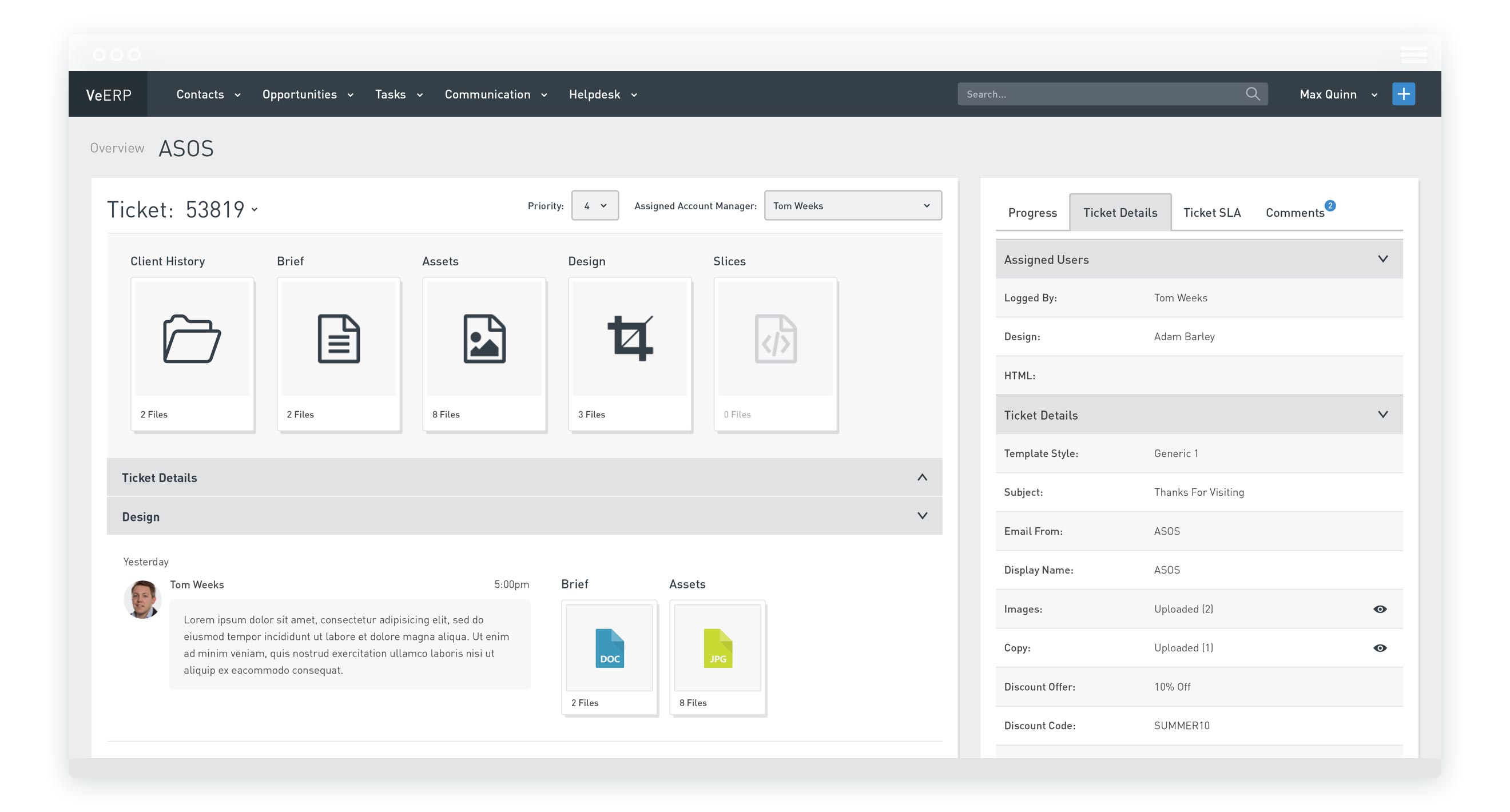
Another insight of research, and general time spent integrating myself into all areas of the company, was that conversation about issues and clients was happening on a range of platforms. Due to the rigid nature of Ve-ERP’s field structure and it’s lack of conversational tools, staff were using a mixture of Ve-ERP, Skype and Email to have discussions that eventually became problematic without a clear trail.
Creating a ticketing system for different areas of the company to raise requests to each other allowed me to design a more conversational and free approach to this while still imposing a necessary structure. It also meant that staff allocation, pipeline management and workforce analytics could also be dealt with much more effectively.
EASY INTEGRATION
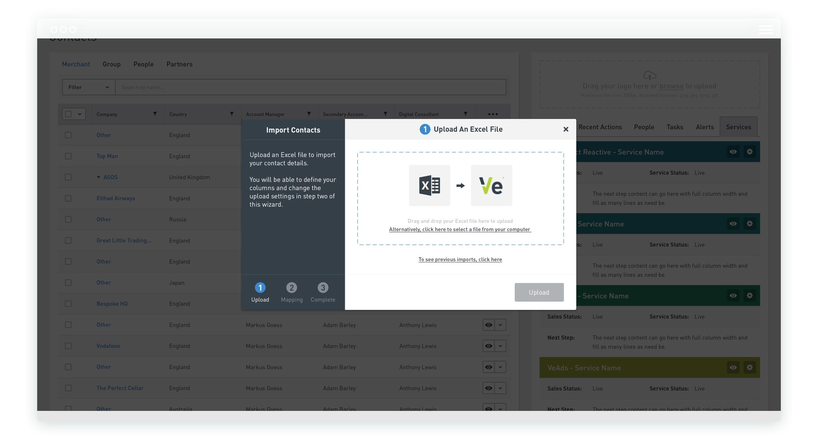
A clear oversight of what had been previously built was it’s lack of empathy towards the staff tasked with using it and a lack of understanding of the reasons they might be struggling to embrace it. One of the reasons that became clear was that they already had systems to do this - generally Excel sheets of differing approach that were useful to them individually but useless on a collective level.
A great example of the type of low hanging fruit rigorous research can often uncover, a simple import feature would greatly reduce the barrier to staff using the product. Working alongside staff to understand the similarities in their current files, I created import systems that would allow them to quickly migrate their current information to Ve-ERP.
END RESULT
Ve-ERP helped a rapidly scaling company through a key growth stage during challenging times and my input raised it’s usage and was met with much appreciation from staff throughout. The first research project of it’s type, it forged much stronger relationships between the product team and the rest of the organisation that not only allowed us to serve the wider company much better in this instance but also in many more.
Unfortunately, Ve-ERP was eventually discontinued. While it’s always a shame to see work you’ve created be left behind, I was actually a key proponent of this decision. My research had highlighted that, as the company’s needs became more and more sophisticated through it’s growth, the immense breadth of functionality required had been vastly under-estimated. To effectively serve it’s users, it would require increased engineering and design resources much better used towards out customer facing products and core offerings.
I’m pleased that my UX and UI work could help ease the transition process, build stronger foundations for growth and fill a gap in a time when it was vastly needed, but I’m even more pleased that my pragmatic research and honesty could help save the company time, money and problems in the future.
To find out more about Ve, where I worked on a large range of projects over a three year tenure, visit ve.com
← PREVIOUS PROJECT
NEXT PROJECT →
Want to make something happen?
Get in touch.