INMOTION VENTURES
BACKGROUND
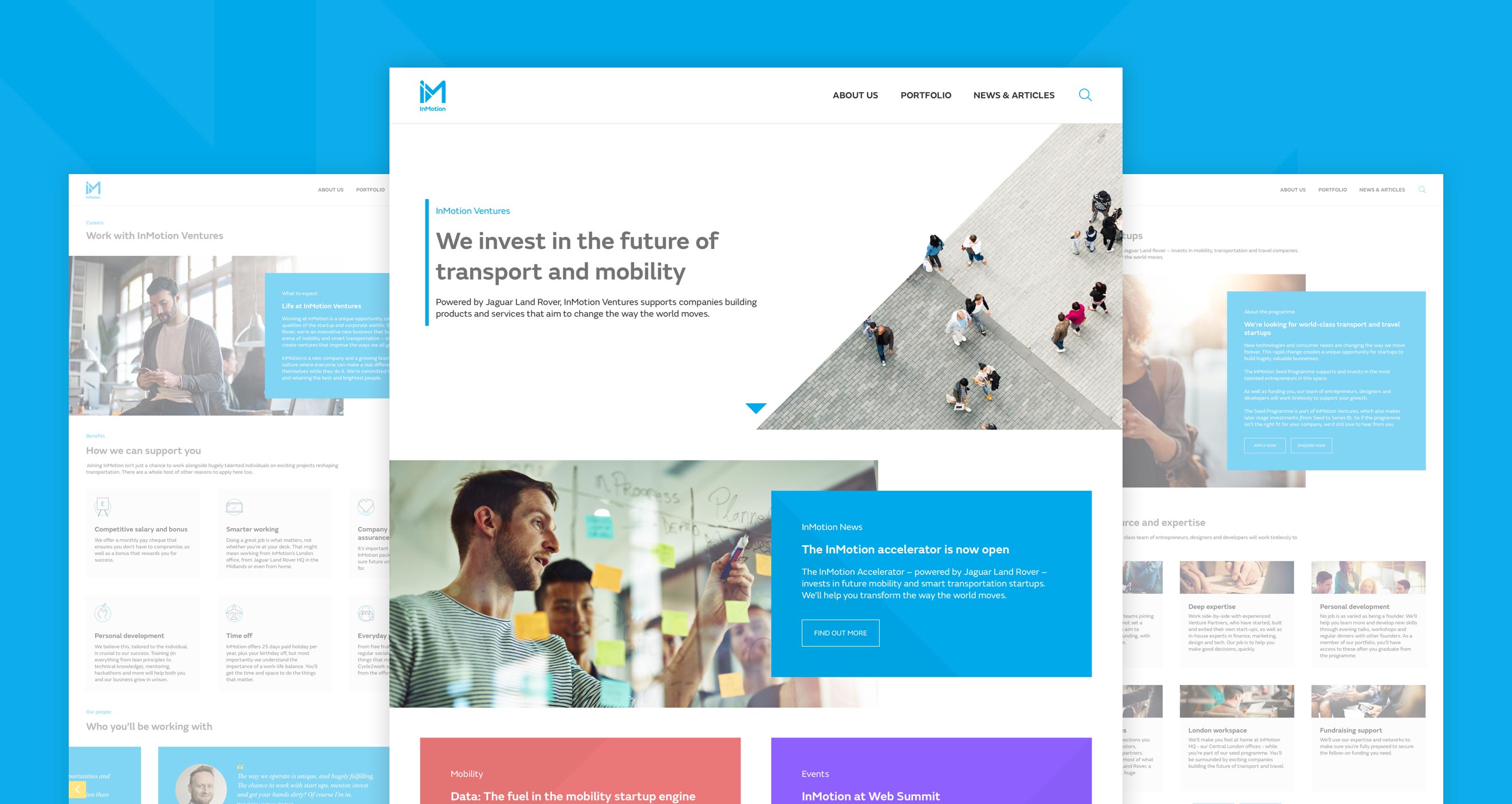
A subsidiary of Jaguar Land Rover (JLR), InMotion is the company’s venture capital arm and Strategic Business Unit. Tasked with exploring the wider mobility landscape, developing and investing in companies that could prove key to JLR’s diversification into it, InMotion reports directly into the JLR board and is a key part of the company’s future plans. My first project after joining the company in 2017, I was given the task of redesigning the entire InMotion website. Going through a change of structure under a new MD, the business wanted to slightly reposition and move away from the editorial, audience building approach of the previous website towards one designed to confidently and quickly portray the company’s key purpose, mission and offerings.
ROLE
Taking design leadership of the project from a very early stage, I was tasked with tweaking and developing the brand already in place and designing the architecture, structure and final interface of the entire site. I worked closely with InMotion’s marketing team to create effective, to the point copy as well as two developers who built the designs into a custom Wordpress theme.



DEVELOPING A STYLE
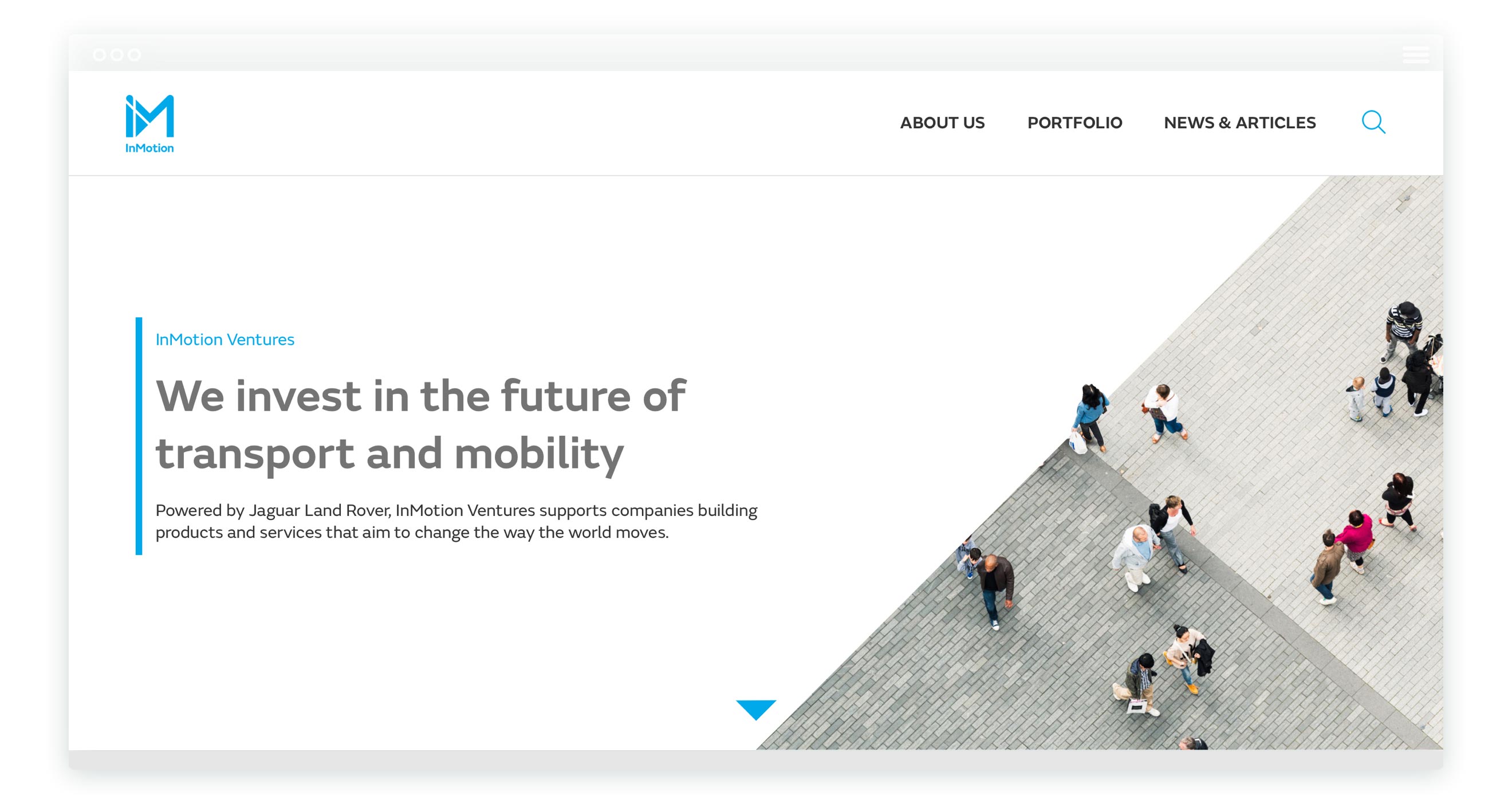
While InMotion already had a brand in place, it was very much of it’s parent company, JLR. The core tenets were great but it’s photography was all about cars, adventure and countryside outdoors, something that didn’t align with IM’s wider scope of travel and mobility in general and particularly it’s focus on younger, modern, inner-city audiences.
Working through a range of photography options and design aesthetics all focused around a minimal, modern approach, I settled upon photography of people moving, both inside cities and out, that portrayed it’s message in a more subtle way. Cutting into it using a key element of the logo - it’s triangle arrow - to create sharp lines combined with clean white backgrounds with a focus on typography, I developed a confident, to the point approach fit for the investment space while still retaining enough character to make it stand out.
A DYNAMIC GRID
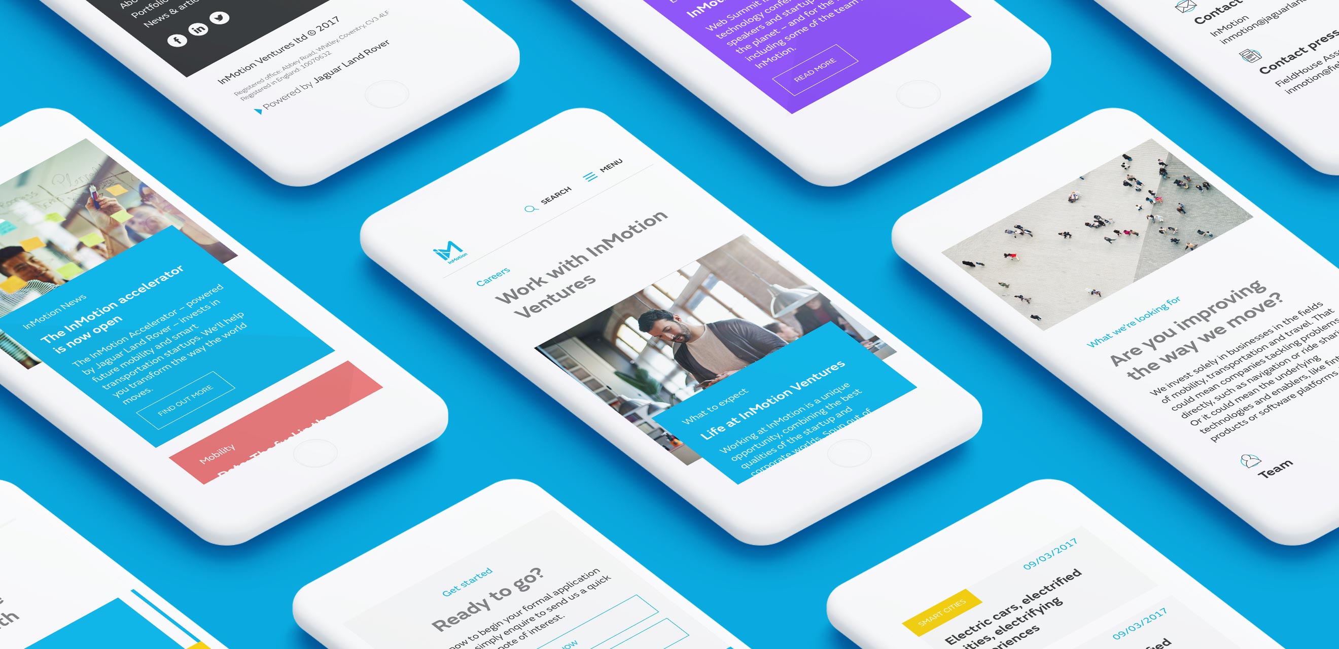
To provide a visual structure fitting for the dynamic, fast moving space InMotion operates in, I developed a playful grid grounded in it’s bold blocks while creating variety and depth throughout the page.
ICONOGRAPHY
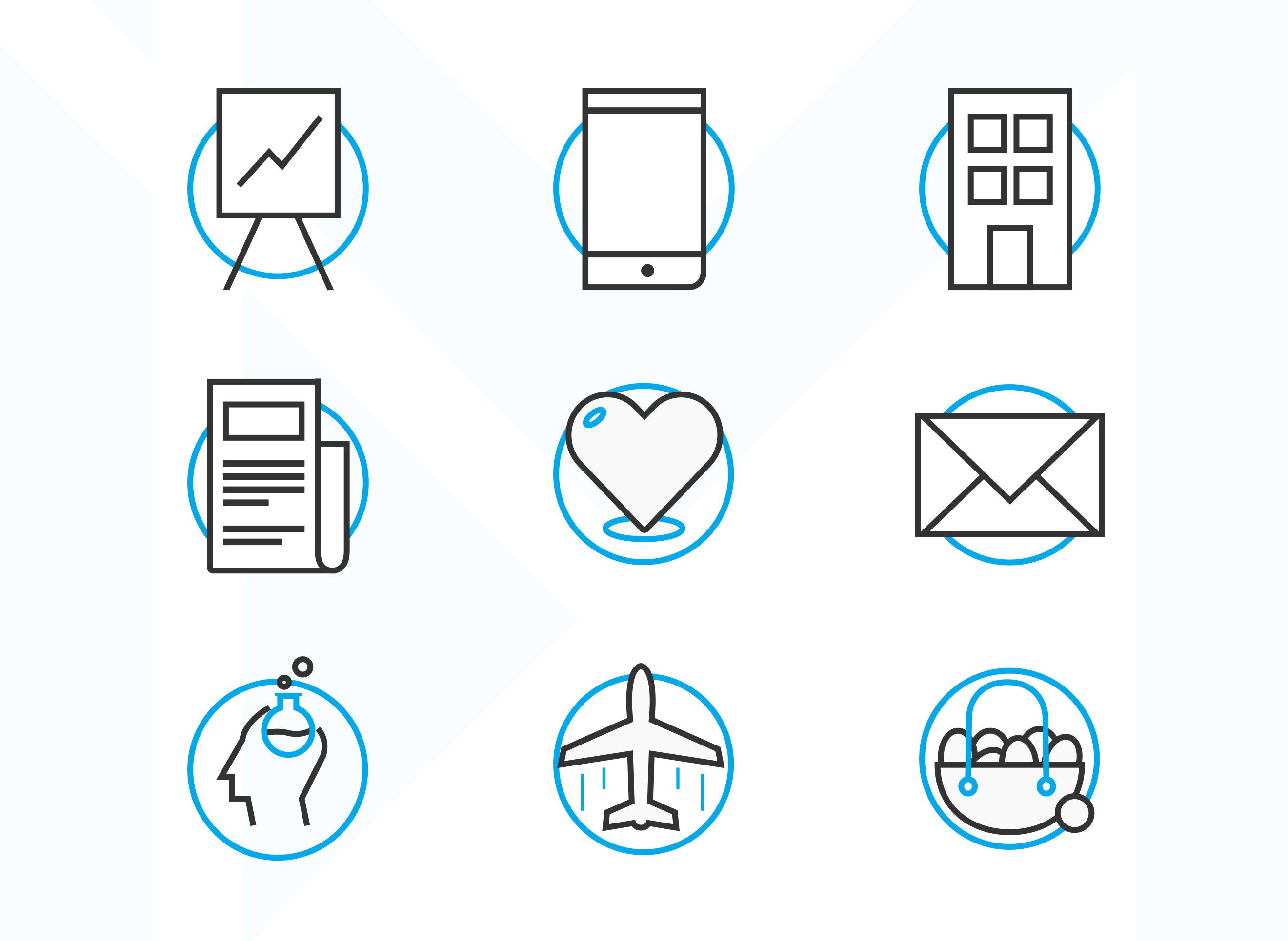
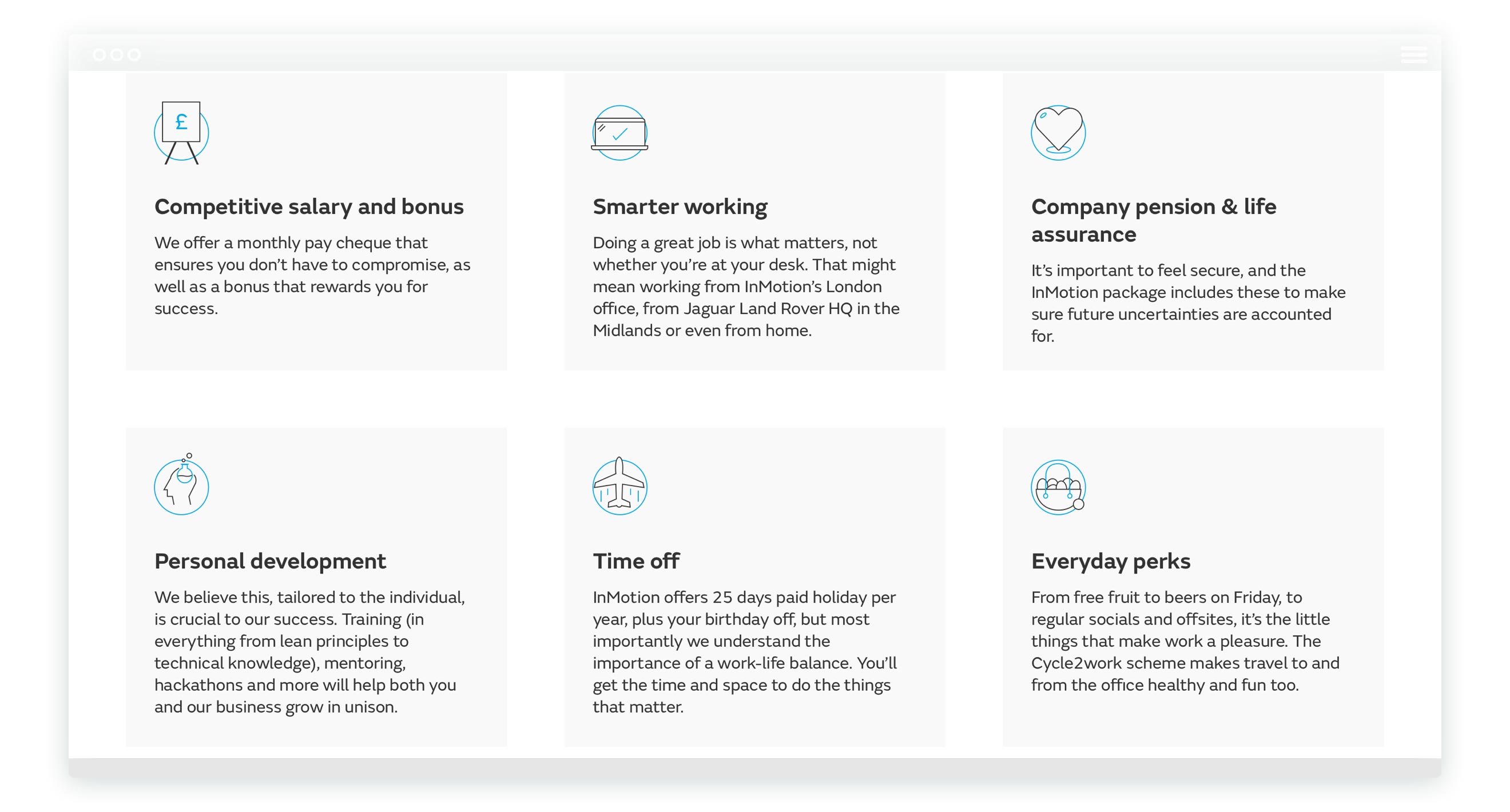
A key part of the way InMotion communicates was always it’s icons, so I wanted to develop these to showcase more character and help add visual flourish to the minimal style. Using a two colour system, I drew a range of icons to help illustrate everything on the website from employee perks to investment approach.
TAXONOMY
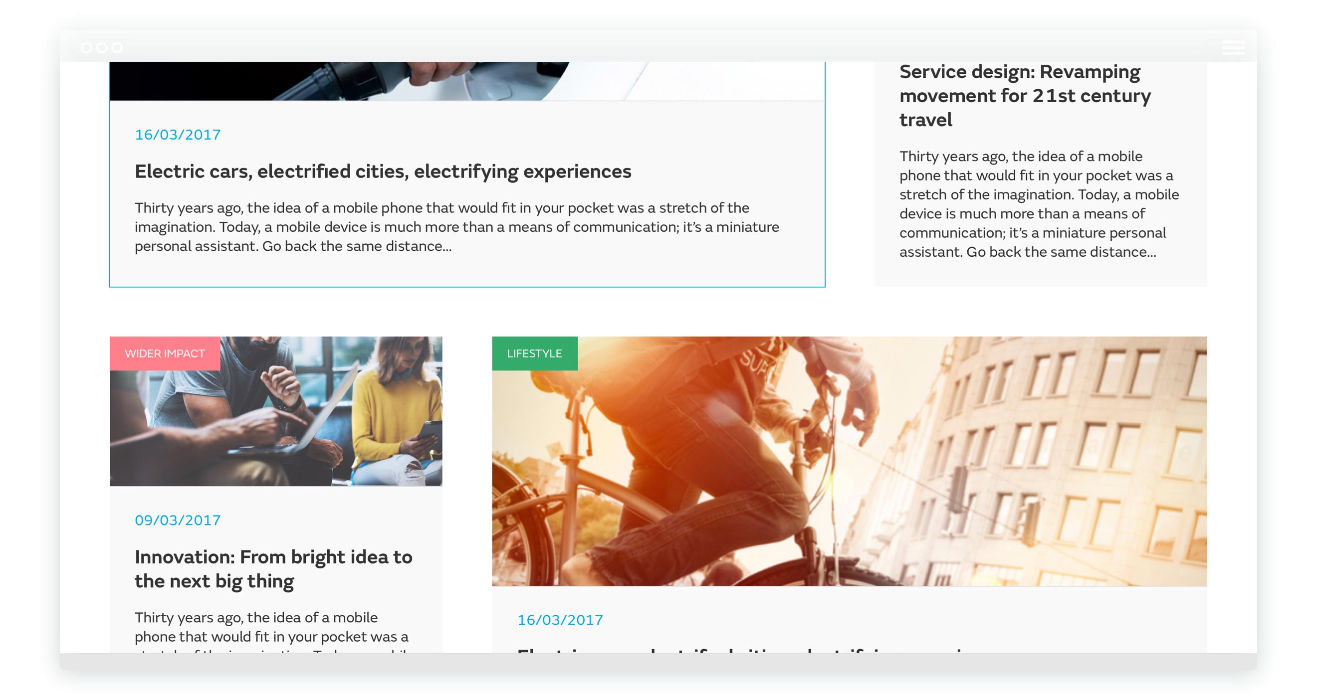
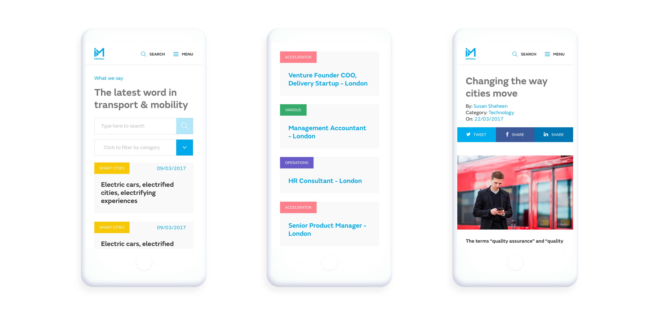
A large website with a wealth of editorials already in place as well as multiple types of job openings, portfolio companies and staff, I leant on the existing taxonomy that had been in place in order to design systems that would not require vast re-entry of content and back end overhaul.
However, by mapping the current categorisation and tagging systems rigorously and developing an understanding of them, I was able to use them to greater advantage. Providing much more structure both for content entry and in visual cues for users browsing the site, I worked with the developers to create a scalable system that allows for great flexibility.
PRE-EMPTIVE CONTENT
Seeking to assert the company as a thought leader on the mobility space and share the vast amount of knowledge contained within it’s staff and subsidiaries, editorial content was still a high priority marketing strategy for InMotion.
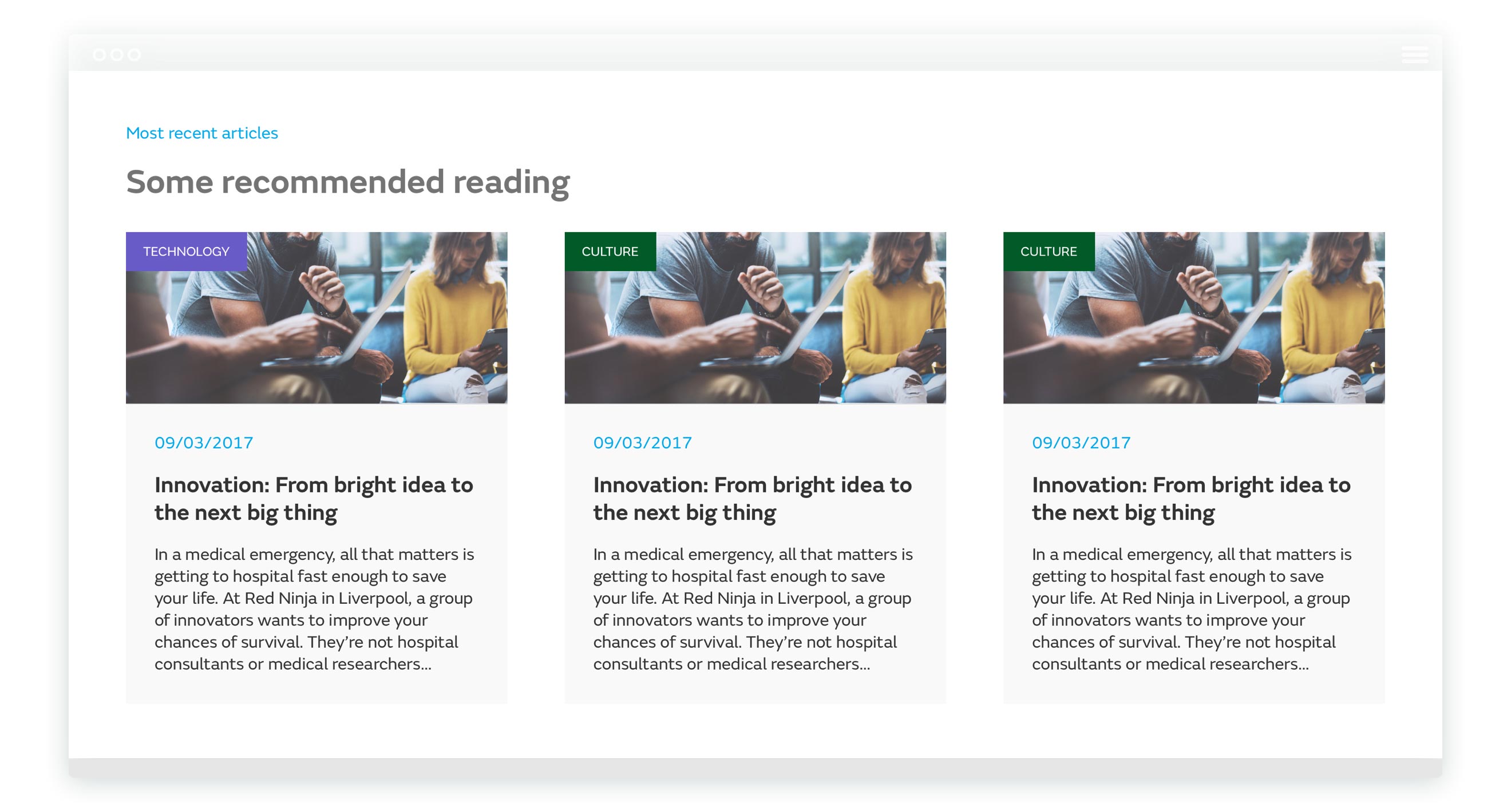
As an expert leader, I wanted to ensure that the website was offering content at key moments, rather than require the reader to search for it. I used a range of devices such as recommended reading, clear and engaging empty states, similar articles, email campaigns and more to do this throughout the website. This creates a journey that requires as little cognitive load on the user as possible while allowing them to really dive deep into the website’s vast archives.
ENGAGING COMMUNICATION
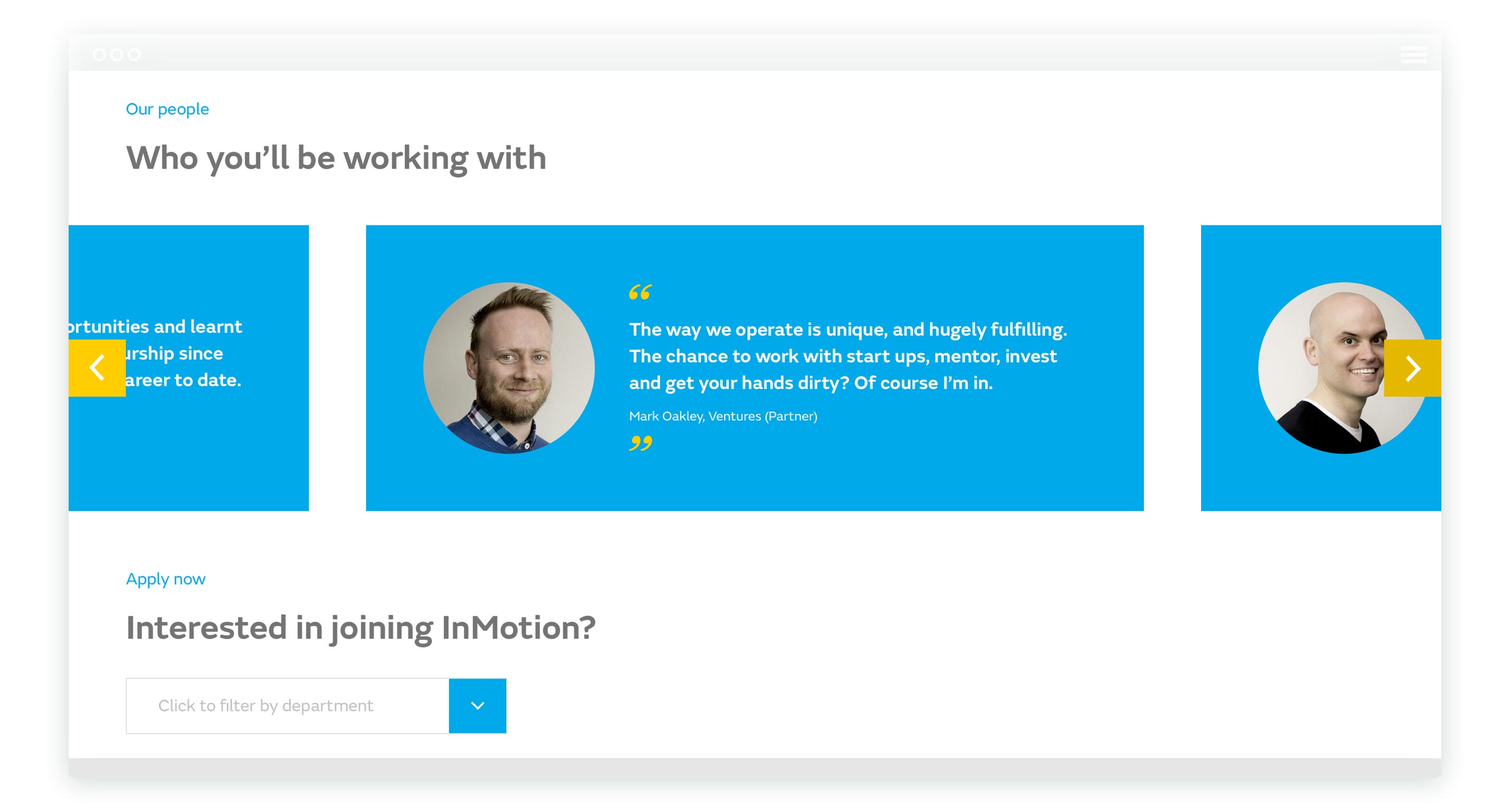
Breaking text up as much as possible, I created bold, engaging blocks of content designed to draw the user in and retain their attention. While there was a lot of content the website needed to cover and that was featured in it’s original brief, this provided a strategy to prevent long passages of text taking up too much of the website and making information difficult to digest.
CLEAR PATHS TO SUCCESS
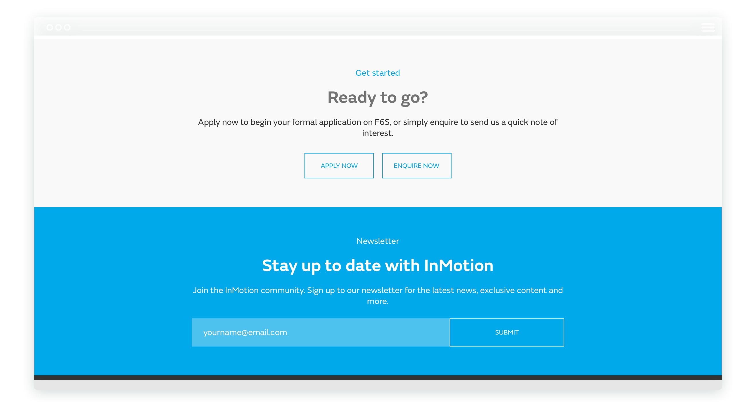
A lead generation website at it’s core, InMotion wanted to communicate with a variety of people in many ways. From founders looking to join the seed programme, to investors seeking to partner with them on investment rounds and press teams looking to gather information, each needed to be served in a clear manner.
By designing clear paths through the website for each type of user and inserting call to actions at the most relevant moments, I created conversion systems designed to quickly segment users by their purpose and then gently nudge them towards getting in touch in the most efficient way possible. Combining these with trackable conversion funnels developed alongside marketing, we created a website optimised for it’s core focus.
THE END RESULT
While I’ve since left the company, the website I designed is still live, providing a front of house for an important subsidiary of one of the UK’s great multinationals.
On launch, the new website greatly reduced bounce rate, increased time on site and increased lead generation across the board. The tracking systems and metrics I had also led the implementation of created the foundations for us to continually improve and generate increased audience understanding.
It was also an excellent way for me to get to grips with the company and it’s values, enabling me to streamline ways of working such as implementing a style guide, design and component system as well as onboarding modern tools such as Sketch and Zeplin to the company.
To view the website and find out more about InMotion, where I worked on a large range of projects over an 18 month tenure, visit inmotionventures.com
← PREVIOUS PROJECT
NEXT PROJECT →
Want to make something happen?
Get in touch.