Knowledge Officer
BACKGROUND
With a goal to become the future of recommendation and discovery in professional education and life-long learning, Knowledge Officer (KO) takes users on personalised learning paths to achieve their career goals. They approached me at a time when they had just received their first round of funding and had almost 20,000 users on the platform. Moving into their next stage of growth, they needed me to professionalise their design and build a premium plan in order to begin monetising their users.
ROLE
As lead designer, I took on design responsibilities across their existing web platform and iOS app while also designing a brand new Android app. I led UX and UI as well as feature ideation, working primarily alongside their CEO. I also dealt with branding, marketing and built a design system to create a scalable and consistent basis for design in the quickly growing company.

ENHANCING THE BRAND
While conducting early tear-downs and analysis of the current state of design at KO, it became clear that there was a solid brand already in place, but it needed modernising and enhancing. Operating in the technology and startup industry where their customers are design educated and demand high quality, the brand needed tweaking in order to become a trusted source of information and fit in alongside other brands within it’s eco-system.

As well as tweaking assets such as the logo and typography, I worked on an illustration style that would add dynamism and delight throughout the brand’s touchpoints.

CREATING A SYSTEM
The existing team had done an incredible job in building KO across two platforms in such a short space of time, but the scrappiness essential to a fledgling start-up is rarely conducive to consistency. In order to create solid foundations for scale, I developed a design system that would help keep it’s style consistent across multiple teams and platforms. As well as dealing with intricacies of style such as typography, fields, buttons and grids, a component system allows provides a basis for larger decision making and greatly speeds up engineering.

FIRST IMPRESSIONS
The first touchpoint to the brand for most of it’s users, the KO landing page was an essential place to quickly communicate the brands proposition. It also provided a great opportunity to apply the new brand to an asset that would help bring it to life and set the tone for how it’s applied across the company.

OPTIMISING FOR ANDROID
With both a web platform and native iOS app already in place, one of KO’s next priorities was to develop an Android app. This would allow them to enhance their user base, particularly in less developed countries which have a high Android user base and had begun to prove key areas for KO’s expansion due to the lesser availability of traditional learning paths for technology careers.
Using the design systems I’d already created, I was able to facilitate development of the app incredibly quickly, maintaining the look and feel of the other platforms while making specific tweaks to best optimise for the Android platform.

ENGAGING ON-BOARDING
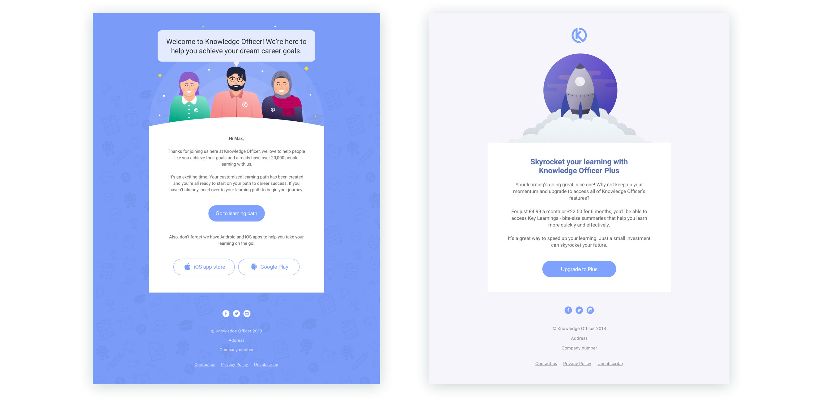
In order to improve the conversion funnel of the app and provide a great first impression for users, I redesigned the on-boarding process. The goals were to create a flow that would educate users to how the key elements and patterns in the app work, allow users to directly experience the benefits of KO before sign up and help them achieve progress in order to make them invested in the product increase the chance of them becoming active users.
I created a chatty, interactive experience to help us learn about the user as they build their learning path, aided by a series of KO expert characters.

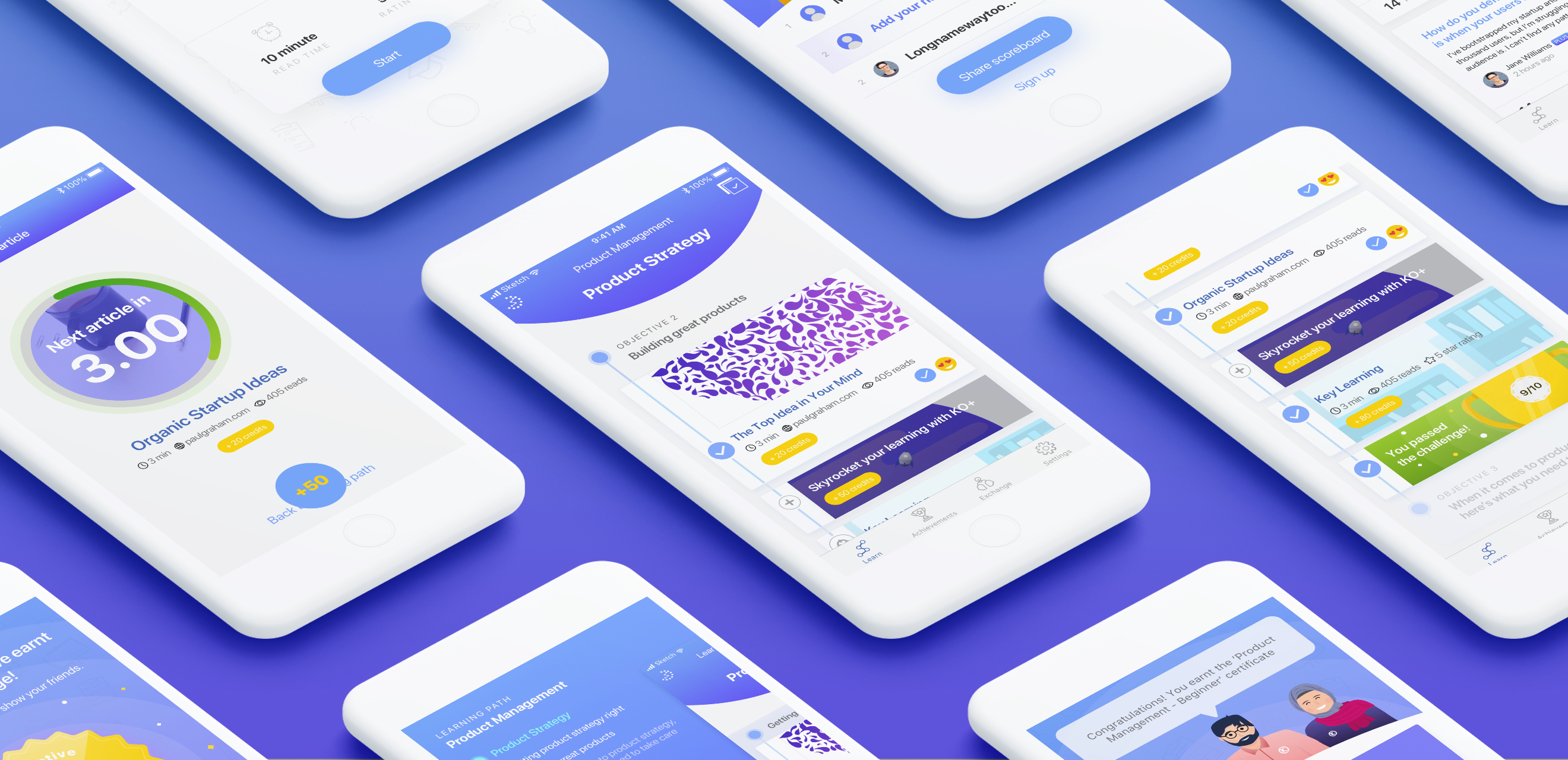
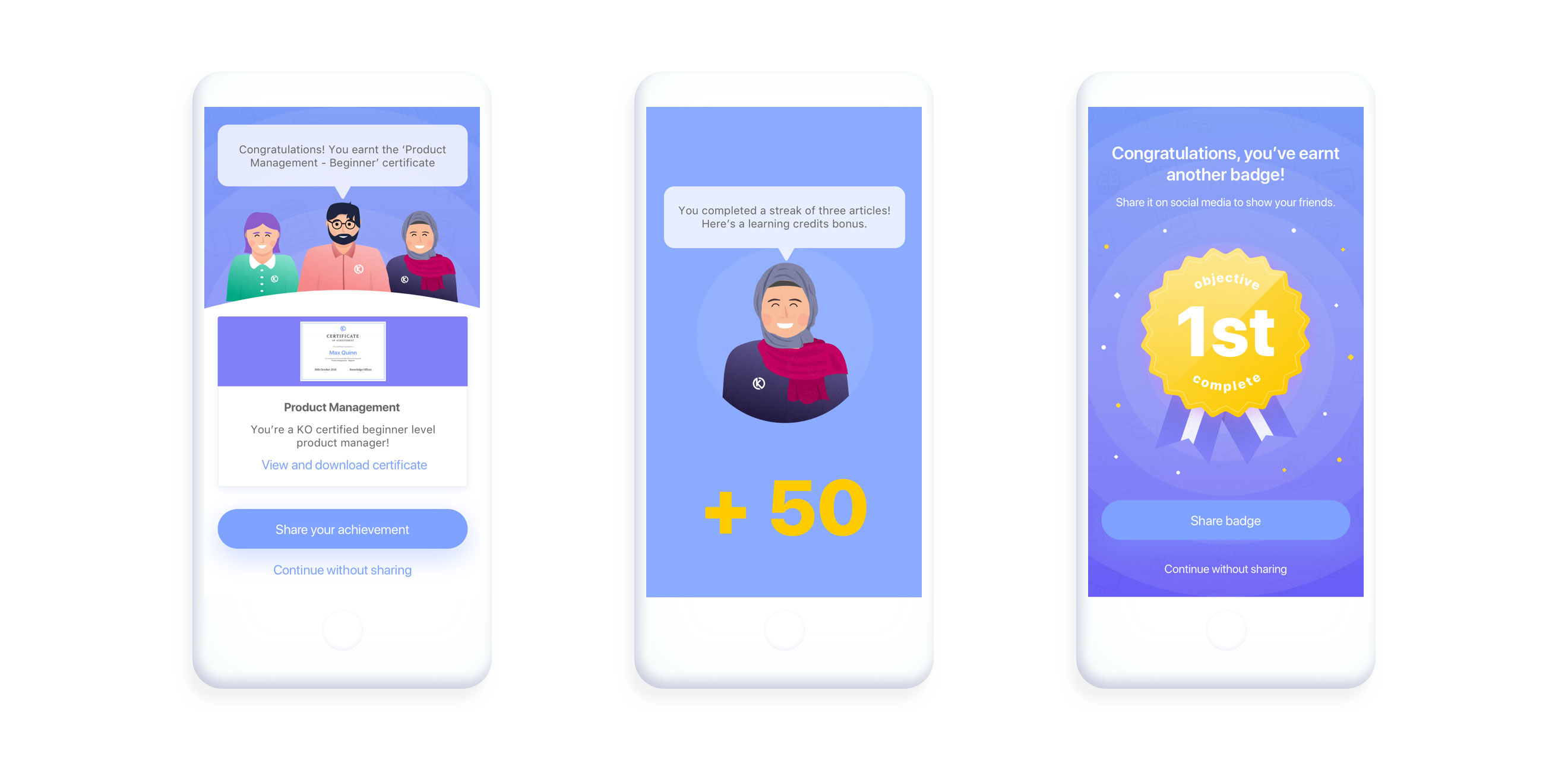
GAMIFIED EXPERIENCE
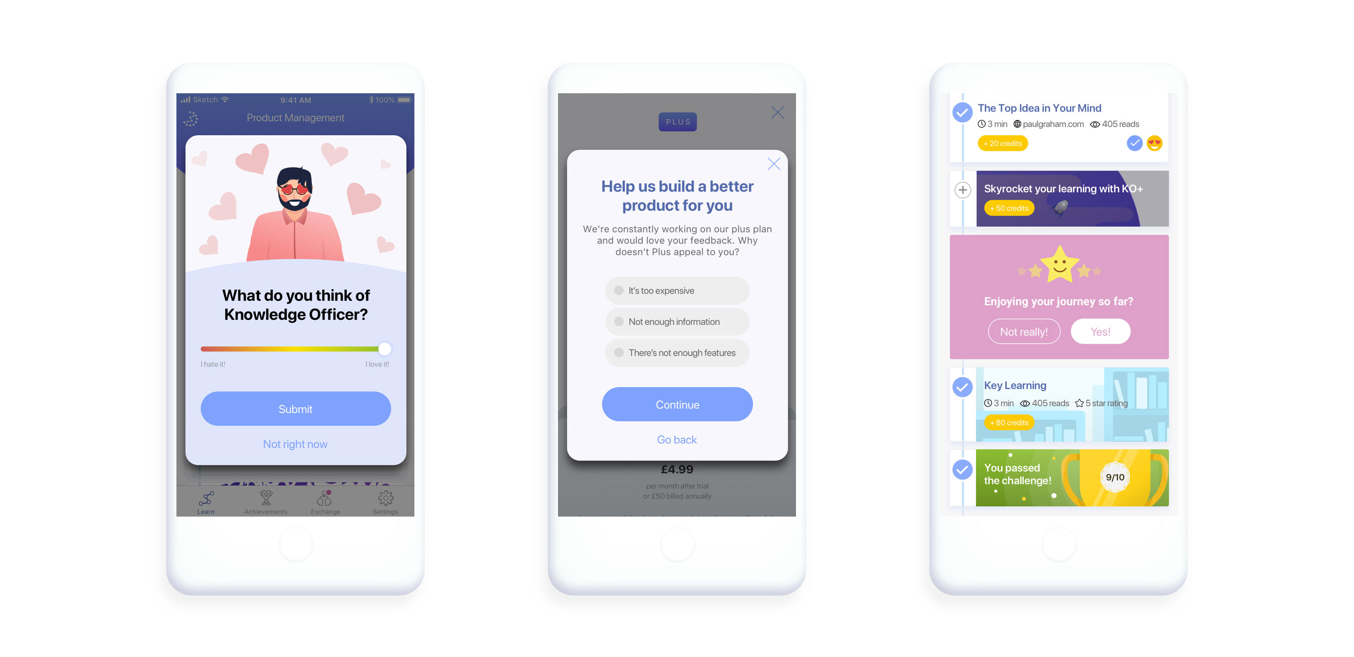
In order to reduce churn and encourage users to make as much progress in the platform as possible, I created a gamified experience. Building off the already implemented idea of learning credits, I made the delivery of this points system much more dynamic and engaging as well as adding hidden prizes, badges, streaks and competitions, features that have increased both retention and engagement figures throughout the platform.
CREATING VIRALITY
In order to grow Knowledge Officer, we needed methods of capturing consumers that didn’t require advertising budgets and would enable us to easily reach relevant users. To do this, we designed a range of features aimed at creating virality. The most basic of these was simply prompting users to share the app to their friends. However, we also wanted to do this in engaging ways. Encouraging users to share badges and certificates was a minor improvement and creates more incentive to share.
A much bolder development was creating a ‘competition’ feature. The app already had challenges which would grade users. Encouraging them to create competitions and scoreboards from these challenges, shared via social media and available to participate in without sign up, would create an engaging first experience for new users and encourage a constant viral loop.
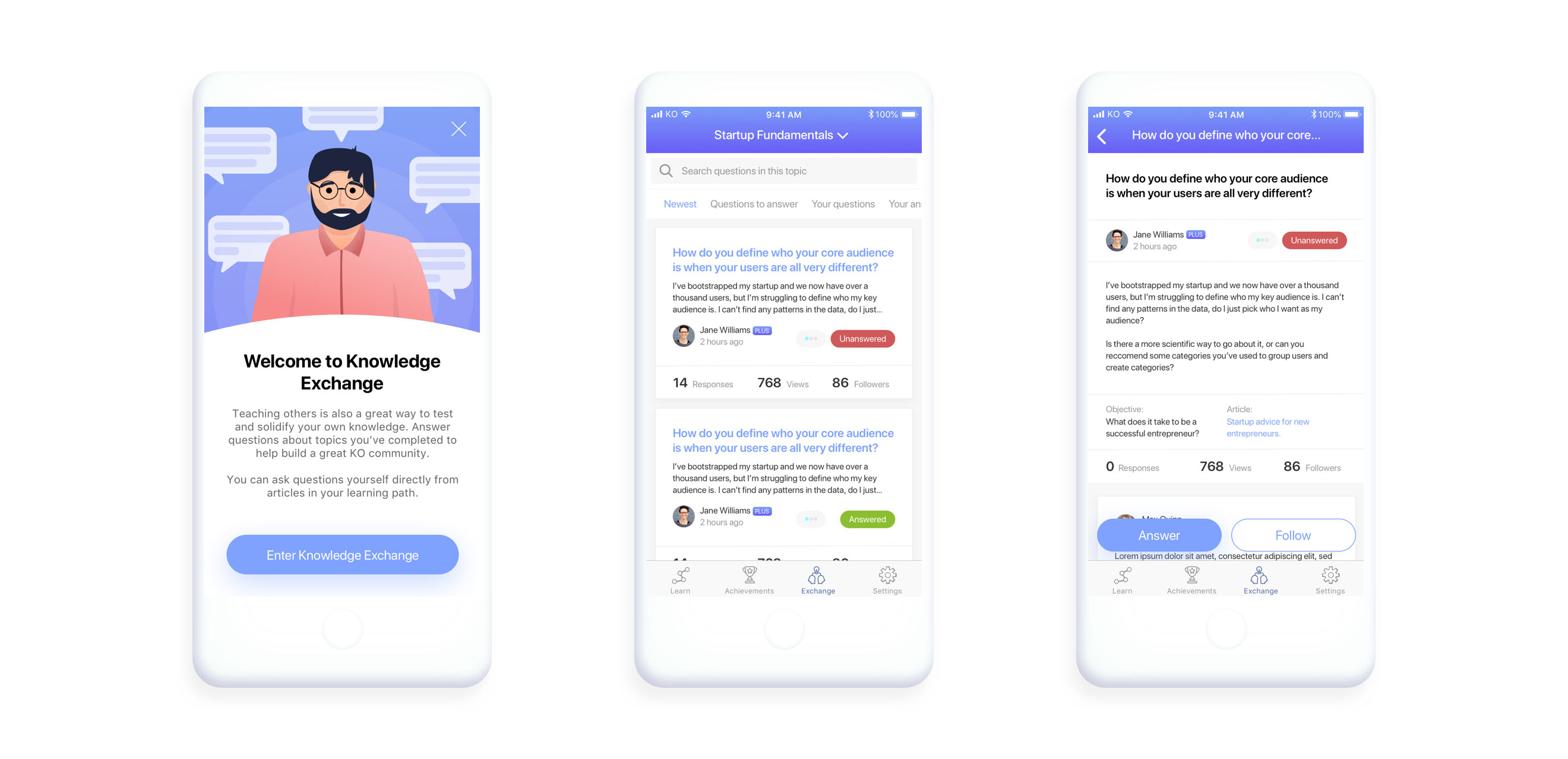
CREATING A COMMUNITY
With a wealth of users all working towards similar goals, we wanted to find ways to connect them and help them learn together. This would likely improve retention as they invest more time and emotion into the app and have human exchanges beyond those that can be provided by the product itself. Enter Knowledge Exchange, a question and answer forum aimed at helping users understand things they’re unsure of while also allowing them to cement their own knowledge by answering the questions of others - a proven way to improve knowledge retention.
By only allowing users deemed ‘experts’ in a topic - those that have completed the topic with a sufficient mark - we aim to keep quality of answers as high as possible. Unlike a traditional forum, questions can only be asked directly from an article in order to ensure their relevancy and reduce general chit chat. By encouraging users to rate answers and accept the best ones the feature can also moderate itself and reduce workload while increasing quality.
MONETISING
In order to monetise Knowledge Officer, one of my key goals was to develop a premium plan, named ‘KO Plus’. Developing extra features such as ‘Key Learnings’ - bite size summaries of topics that allow users to learn much more efficiently - I began to add extra value to the app and create content that went above and beyond the existing model of curated content from the rest of the web. I also imposed limits on other parts of the app, such as the amount of questions a user can ask in Knowledge Exchange and the scoreboards users can create, in order to lift them for the Plus plan.
Creating smooth upgrade flows and prompting the user at the most opportune moments, such as when they have just had a great experience or when they have hit a limit, I made the upgrade process as simple as possible. Offering free trials of the plus features and discounts in exchange for learning credits, we also encourage users to trial and therefore see the benefits of the Plus plan as much as possible.

ENCOURAGING FEEDBACK
As a young product, one of the main goals of Knowledge Officer - and a key tenet of my approach to design - is to solicit as much feedback as possible. To that end, I created a range of feedback prompts based around actions such as completing tasks, cancelling Plus account, refusing Plus account and many more. Carefully spread throughout the app so as not to be intrusive, and at times shown in a soft manner so that a user can engage only if they see fit, these prompts encourage a constant feedback loop essential to us as we further hone market fit and improve the product.
THE END RESULT
Knowledge Officer is continually growing and has received excellent user feedback and press, including a 4.2 star rating on the app store and features in Forbes, Menabytes, UKTN and many more.
The Plus plan I designed is leading the company towards monetisation, rapidly receiving sign ups across the globe. Conversion rate and churn has also rapidly dropped and with each improvement we’re seeing users spend more and more time in the app, both with longer sessions and more regular visits.
View the website and download the app at knowledgeofficer.com
← PREVIOUS PROJECT
NEXT PROJECT →
Want to make something happen?
Get in touch.