Chosen
BACKGROUND
A founders factory backed company, Chosen has developed complex machine learning algorithms to analyse the experience of job candidates and add context to their roles. Moving away from the traditional keyword search for job candidates in the recruitment space, this allows them to match candidates to employers based on much more relevant factors, such as the size of the company they worked at, the challenges they faced and the successes they achieved. However, with a customer-facing platform that was a very basic minimum viable product, it’s usability and functionality wasn’t effectively making use of the incredible work going on behind the scenes.
ROLE
As lead designer, Chosen bought me into their team in order to completely overhaul the web platform. It required a visual clean up and advances to the brand as well as a complete UX rethink to better help clients achieve their targets of sourcing a steady stream of the highest quality, most relevant candidates for their open roles. Once this was complete, I then moved onto the landing page, ensuring it effectively and appealingly communicated the benefits of the new product.
VALUES
After conducting interviews with the key stakeholders to understand the challenges and aims of the product, I developed four values for the product and delivered them as part of a kick off document also including more tangible goals and metrics to align on how we make decisions and measure our success.
Chosen should feel like a two way conversation and be iterative towards the user’s goals.
Chosen should guide you through the process and pro-actively help you achieve success.
As a product based around Machine Learning, Chosen must be open and encourage feedback.
Chosen’s algorithms are incredibly powerful, something that should be apparant throughout.
AN INTUITIVE ARCHITECTURE
Something that quickly became apparant when conducting early analysis and user testing of the current product was that the core flows didn’t line up with how recruiters search for candidates. Searches were treated as individual projects, rather than part of a wider search for a particular role. What’s more, only favourited candidates from the searches were saved, which combined with a long wait time to perform searches was creating a lot of user frustration.
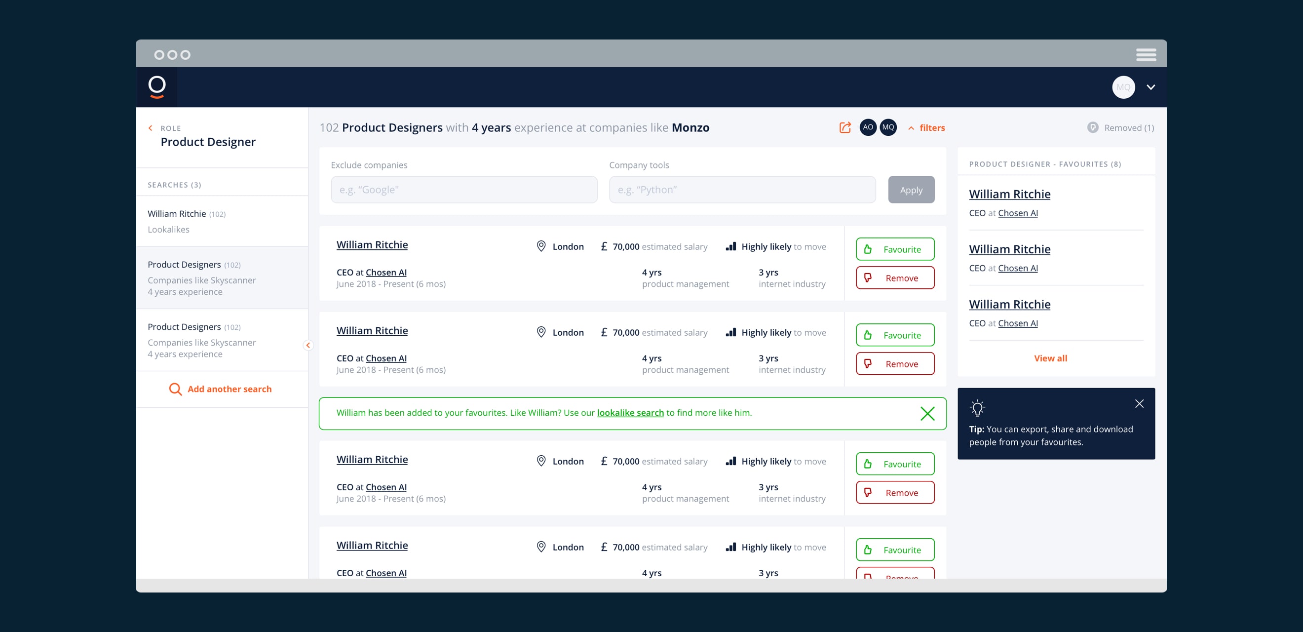
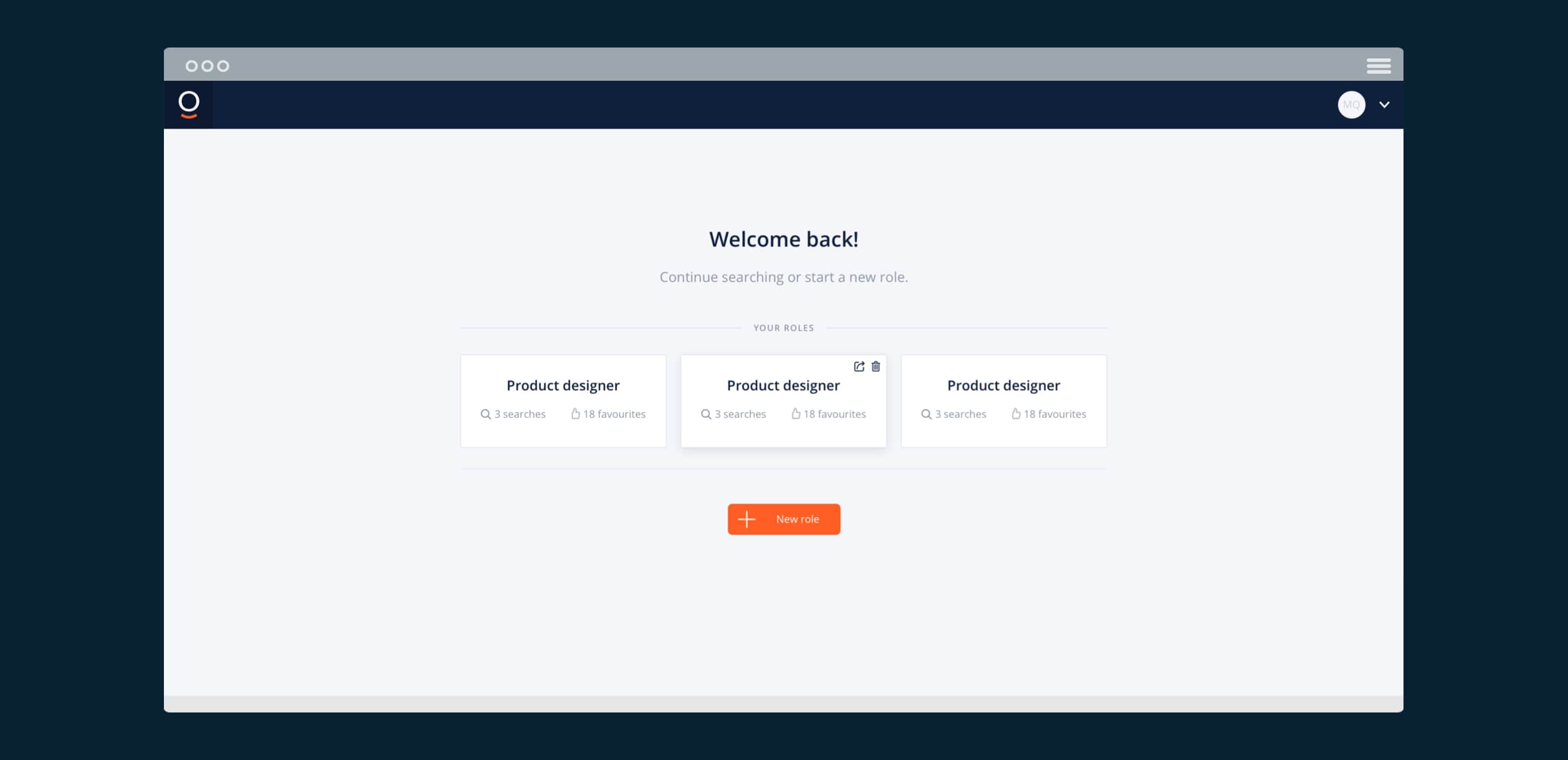
Aligning to a more natural workflow, I created a platform architecture that automatically groups searches into roles and creates a project work-space per role that becomes an iterative space to improve on results and find increasingly relevant candidates.
SIMPLIFIED SEARCH
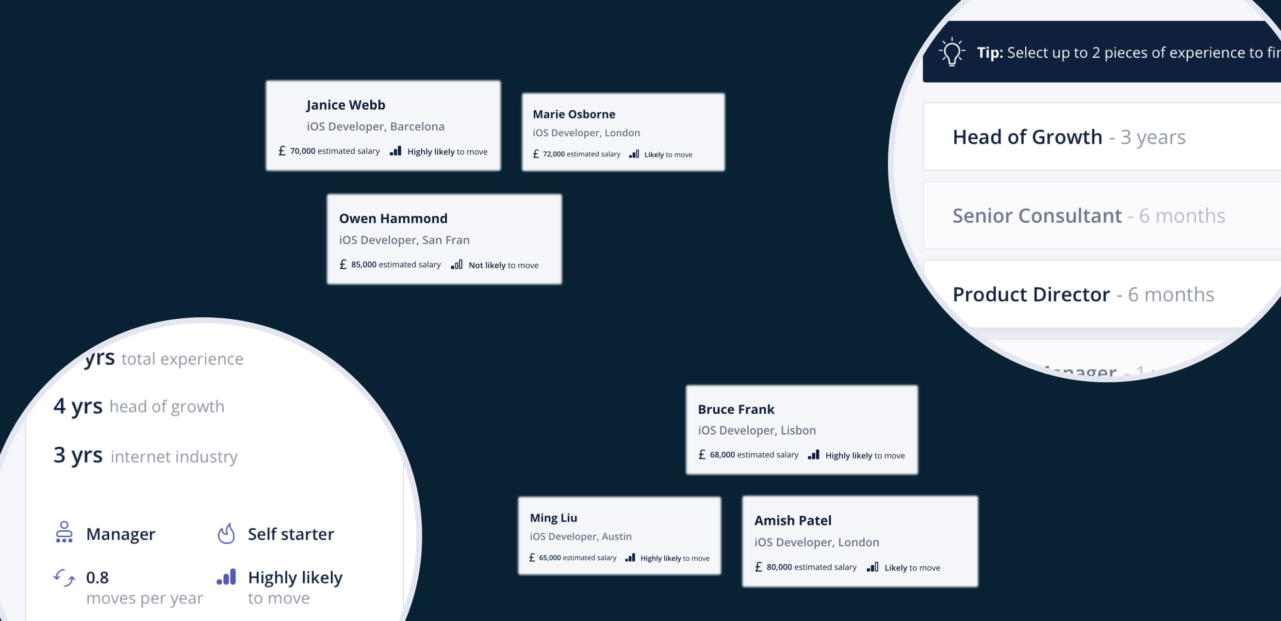
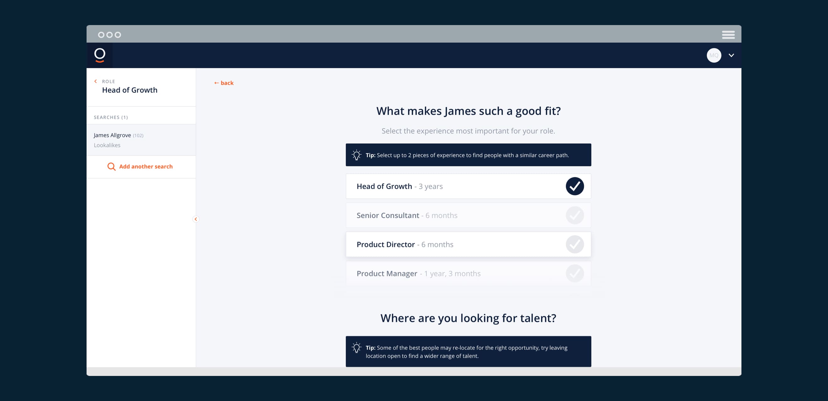
The main value users receive from the platform is high quality, incredibly relevant candidates for their searches. It’s will always be how they judge Chosen, so we had to make sure that we helped them achieve great results even on the first search. Re-designing search to be more friendly and conversational, we provided multiple options including a Chrome extension to search similar candidates to a LinkedIn profile, a ‘lookalike’ search to search for similar candidates within the platform and a ‘candidate builder’ to allow users to create their own ideal candidates.
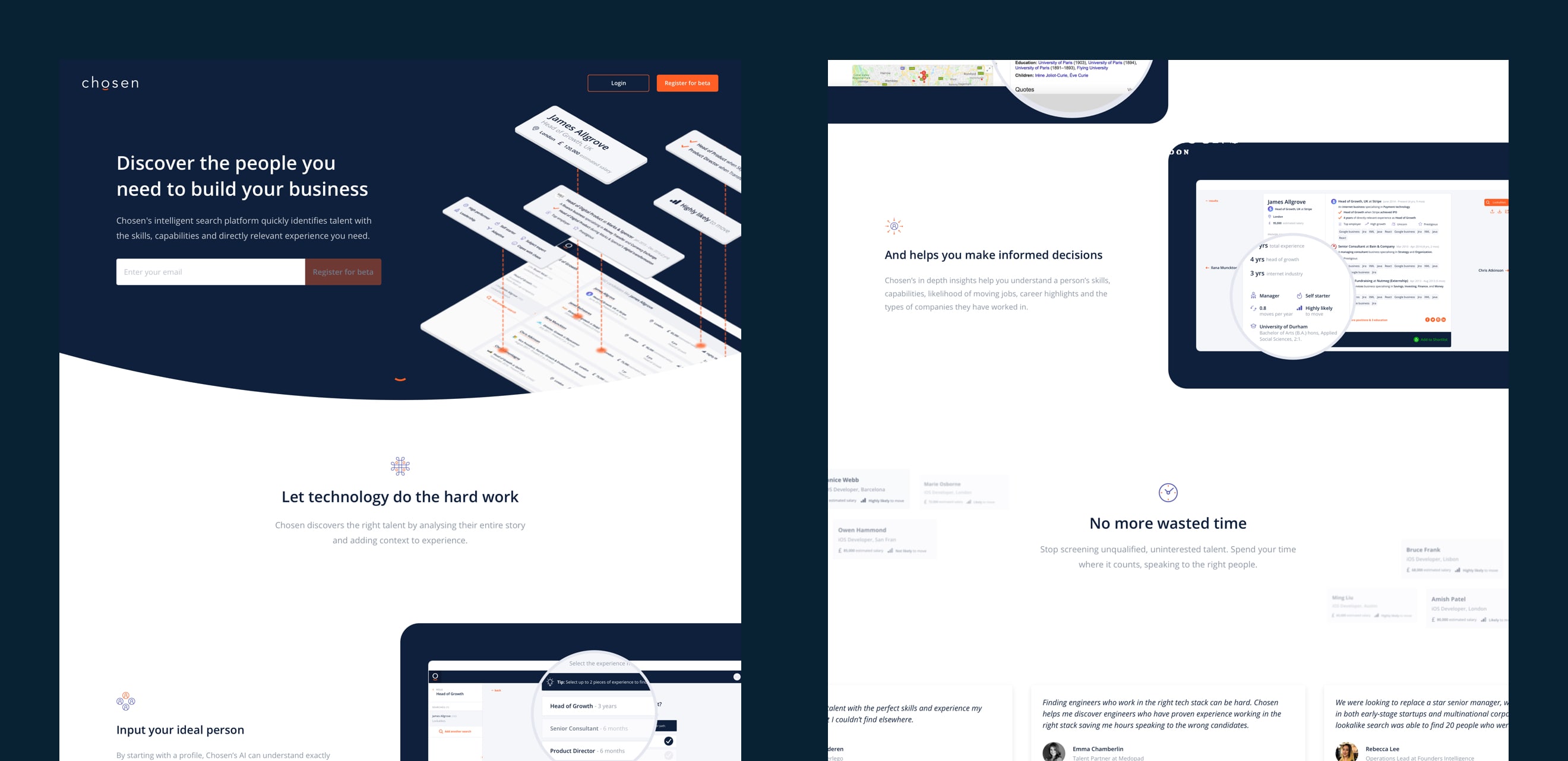
CONTEXTUAL ANALYSIS
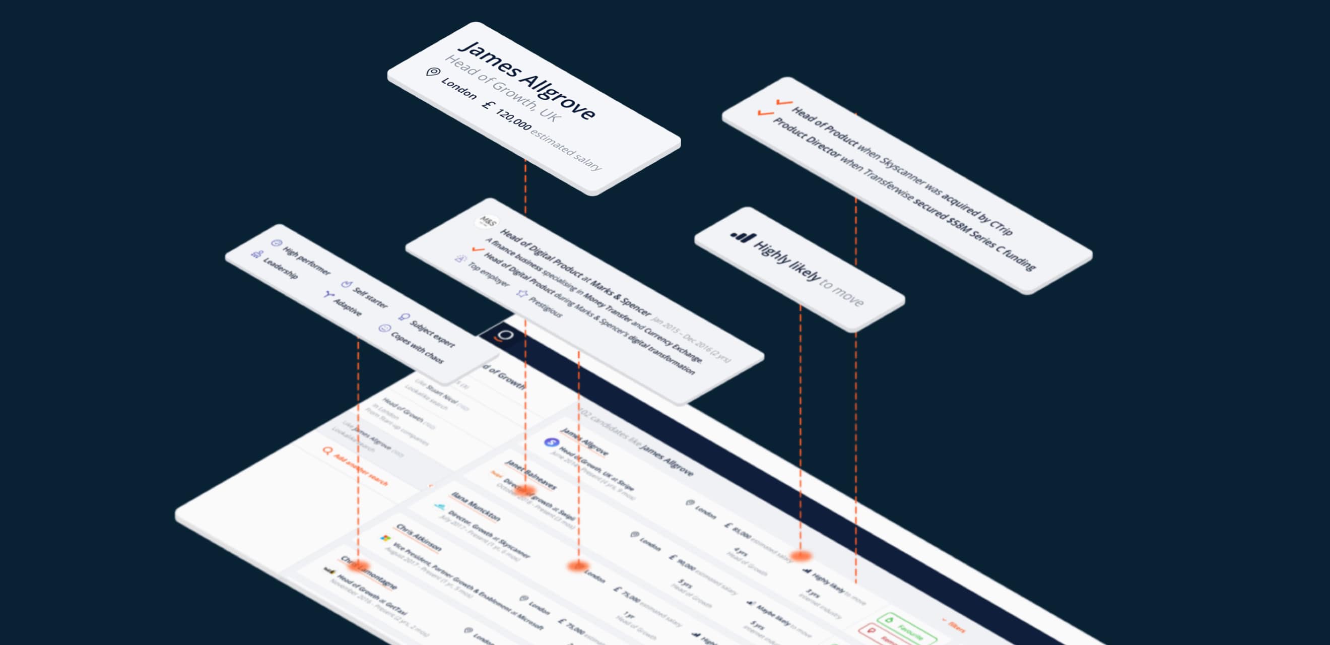
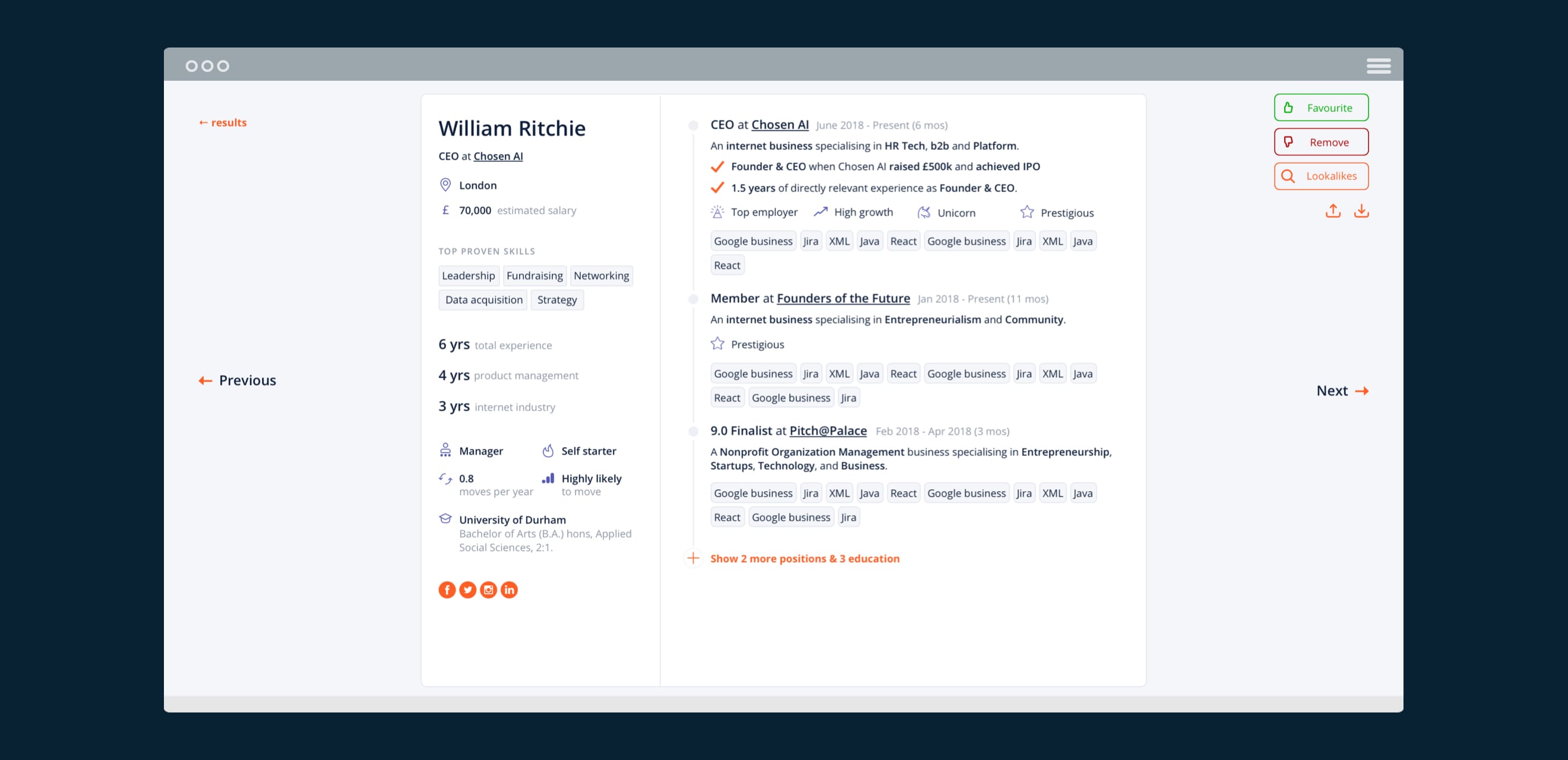
In order to effectively showcase the level of context Chosen can generate on a candidate, I created automatically generated candidate CVs. They highlight the candidate’s attributes in relation to the search and simplify comparison by providing a standardised format throughout. They are also very sharable summaries to encourage users to share with their colleages and thus help Chosen become more ingrained in a business.
ITERATIVE SEARCHING
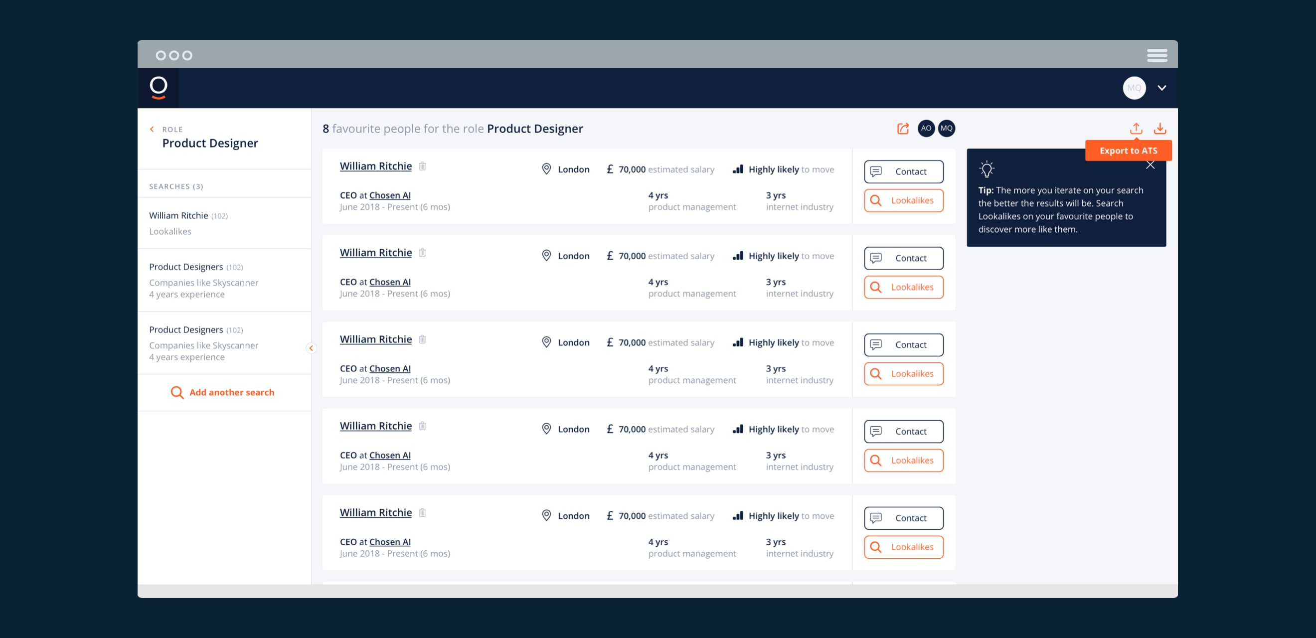
By encouraging users to ‘favourite’ or ‘remove’ candidates from their search, we could not only generate more feedback in order to constantly improve the Chosen algorithms, but also very quickly improve the user’s search results. Realising that recruiters often discover more about what they’re looking for through the process of searching, I made it easier to iterate by allowing them to search for ‘lookalikes’ on their favourite candidates. This would instantly populate a search with the relevant values of that particular candidate.
CONSTANT FEEDBACK
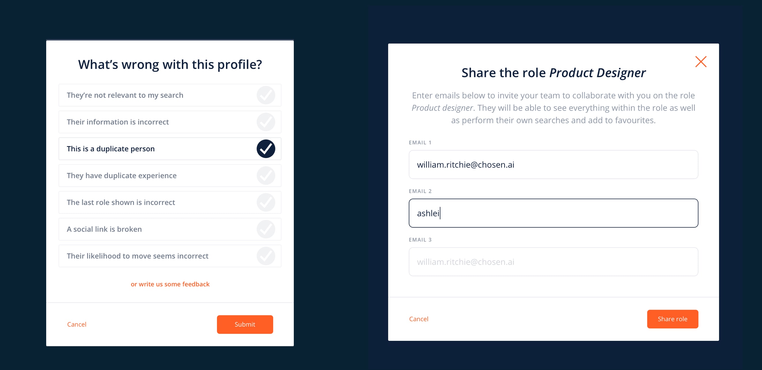
The more feedback the algorithm receives, the better it becomes. Both for the user providing feedback and for the entire pool of companies and users on the platform. So as well as implementing the ‘favourite/remove’ system, I created many other feedback points throughout the platform. While some of these were obvious feedback requests to the user, others were more subtle methods of them approving and disproving candidates such as sharing them or contacting them.
COMMUNICATING VALUE
Moving onto the landing page, I worked together with the Chosen team on further defining their proposition and communicating the true value of the product quickly and appealingly. Designing a concise landing page to help get the product to market quickly, I provided animated icons and prototypes to help the development team add dynamism to the page.
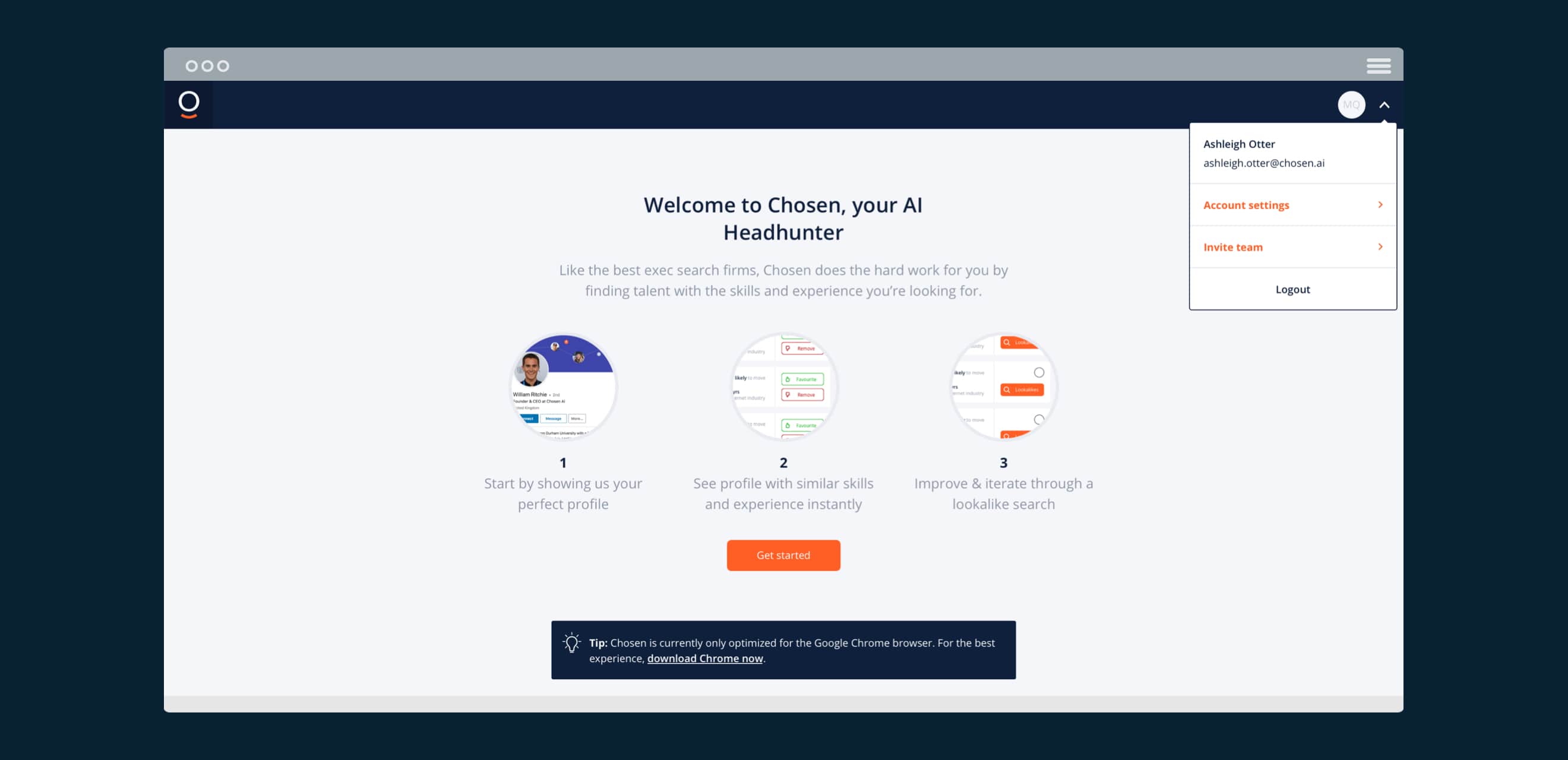
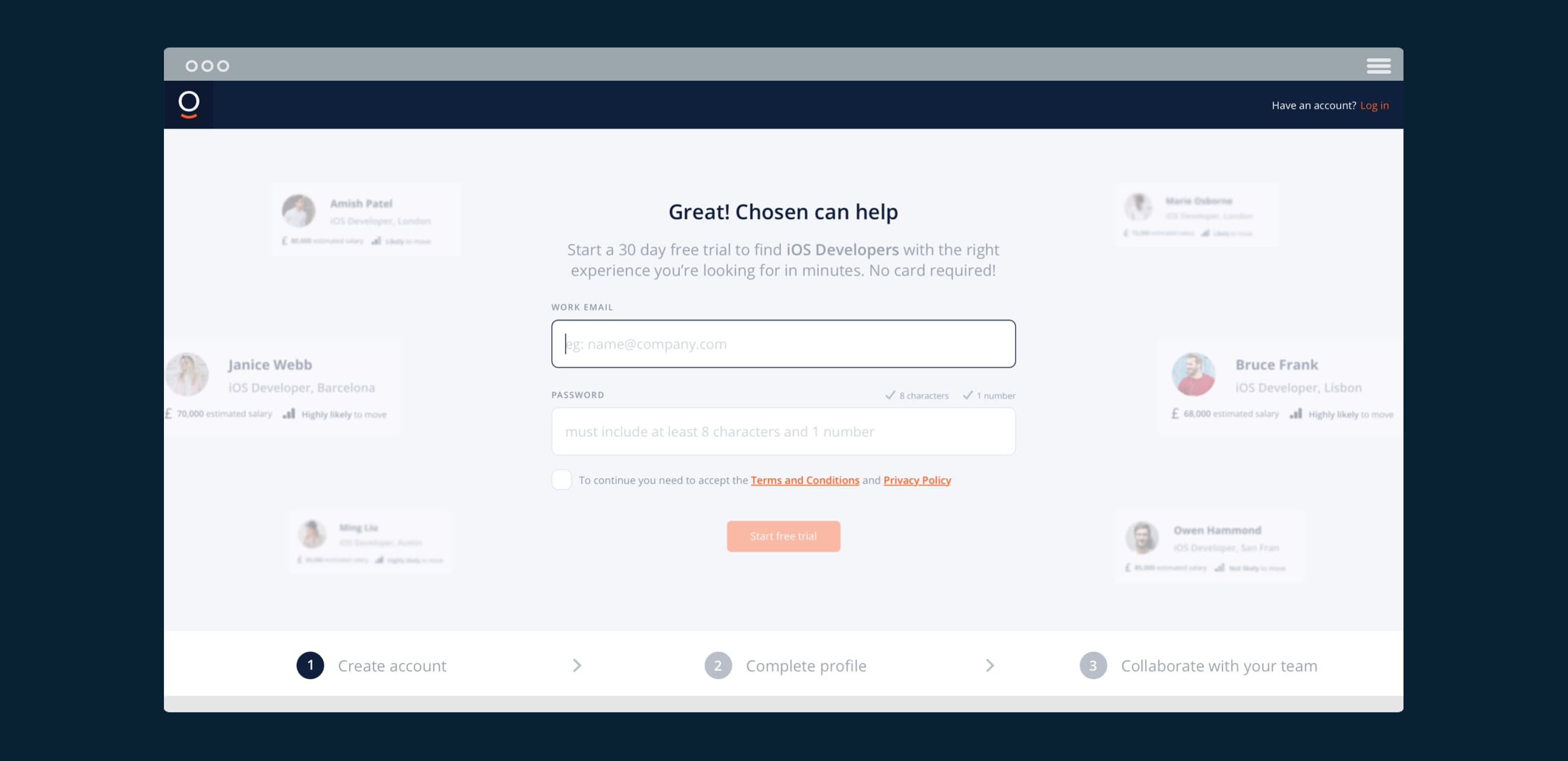
MOTIVATIONAL ON-BOARDING
Connecting the dots, I finally created an on-boarding flow to reduce the operational load on Chosen’s team. Using empty states and tips to educate users to the platform and encourage key actions, I teased value throughout using illustrations and decorative elements to help keep up the user’s motivation and create a great first impression.
THE END RESULT
Having launched to market, Chosen is constantly iterating on both proposition and product and has gained some of the UK’s largest companies as it’s clients.
My quick work, delivered over a 3 month part time engagement, helped them properrly launch their product to market to both train their algorithms and provide constant learning about their users and the product space. It also gained them their first paying customers, a milestone in any young startup and proof of the value of their approach.
Read more about the service at chosen.ai
← PREVIOUS PROJECT
NEXT PROJECT →
Want to make something happen?
Get in touch.